e
-

Core77 Weekly Roundup (4-15-24 to 4-19-24)
Here's what we looked at this week: Startup Humane has debuted their Ai Pin,...
April 19 New
-

Packaging Design Case Study: Zenpack's Sustainable Solution for Coffee Pods
Zenpack is a packaging design firm with a key difference from competitors: They also...
April 19 New
3 Comments -

Wera's Screw Gripper for Non-Magnetic Screws
This screw gripper, designed and manufactured by Wera Tools, is for holding non-magnetic screws...
April 19 New
1 Comment
-

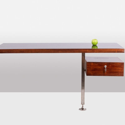
A Beautiful Mid-Century Chair, Occasionally with a Surprise Mechanism
The Tove Lounge Chair, by Madsen and Schübell
April 19 New
2 Comments -

-

A Nakashima-Inspired Walnut Bench with Unusual Details
The Lee Bench, by Marco Campardo at Grimsdyke Farm
April 18
Directory Company Profiles
Core77
Industrial Design
Resources
Industrial Design
Resources
-
Core77 Directory
Find the Best Industrial Design CompaniesGo -
 Delve
DelveWe are a multidisciplinary product innovation and development firm that brings bold ideas to market....
-
Ammunition
Founded in 2007, Ammunition is led by partners Robert Brunner and Matt Rolandson. Our work is create...
-
Olivialand Studio
Olivialand Studio, founded by Olivia Blechschmidt, is a boutique industrial design consultancy that ...
-
Evolve Collaborative
We are an independently owned design agency that helps teams drive change. Together, we partner wit...
-
Pq Design Group
PQ Design Group is the preferred partner for ambitious startups and global brands, offering a pragma...
-
Spatial Dynamics
Spatial Dynamics is a hardware product design and development agency located in Cambridge, Massachus...
-
Brash Inc.
Great ideas are just the beginning. Transforming an idea into a product is a demanding journey fille...
Boards
Need some advice? Seeking feedback on a project? The conversation starts here.


K
{Welcome
Create a Core77 Account
Already have an account? Sign In
By creating a Core77 account you confirm that you accept the Terms of Use
K
Reset Password
Please enter your email and we will send an email to reset your password.