e
"Living With" Product Review: MacBook Pro and LED Cinema Display

For this review of the new unibody MacBook Pro (and new LED Cinema Display), we are hopefully going to give you the type of review you won't see elsewhere: One that focuses predominantly on how the physical designs of the two machines, and the decisions that Apple's designers made, affects the user's experience on a practical level.
We'll start by having a look at the MacBook Pro's new physical features, and specifically looking at how they change your experience as compared to the previous generation MBP. New Ports Location All of the ports on the new machine are on the left side, an arrangement I definitely prefer to the old machine's, where cables are coming out of both sides of the machine. It made it easier to locate ports and reduced cable clutter.

New Internals The new machine runs significantly, noticeably cooler. No more palm burn!
New DVD Drive Location The new machine has the slot on the right hand side. My old MacBook Pro had the slot in the front. Because I place a book underneath the rear end of my old MacBook Pro (for heat ventilation), placing my old machine at an angle, every time I ejected a DVD it would hit the desk surface, requiring a little finagling.
The new machine's side-ejection means I don't have that problem (not to mention it runs much cooler, so I don't have to prop it on a book), but I did often have to move my (thick) mousepad and/or mouse to access the disk. Still, I definitely preferred the right-hand slot.
New Battery Compartment I'd swapped out the hard drive in my old MacBook Pro, which was only slightly less complicated than building a missile. The new MacBook Pro has been designed for easy hard drive access; pop the battery off to gain access. Due to the "no tampering" contract I had to sign, I was unable to test this feature out by swapping out the drive.
Glossy Screen The new MBP has one screen option: Glossy, whereas the previous model offered a Matte option. I feel removing this choice from the consumer was a mistake. I usually don't mind when Apple removes choices from me, because they so often get it right I am happy to go along with whatever they have decided is best. However, in the case of the glossy screen, I disagree that this is best. Photos and videos look absolutely fantastic with the glossy screen--unless there is black in the image, which turns your screen into a mirror.
When working on images in Lightroom, a common trick is to hit "L" to black out everything but the photo; but in this case, the clutter of the toolbars removed by this trick is supplanted by the clutter of whatever is reflected in the screen, i.e. the room around you. This is an unwelcome distraction when trying to focus on an image.
If you're watching a movie, every time the picture darkens or fades to black, you get an unwelcome reflection of you sitting in front of the monitor and the room behind you. I found this distracting, as it snapped me out of the movie. After a month of usage I still did not become acclimated to this.
New Black Screen Border The new MBP has a black border around the screen, as opposed to the silver border of the previous model. In side-by-side comparisons, I found the new black border better for working with photos in Lightroom, as it blends in with the interface (when it's not reflecting) and makes it visually easier to focus on your photograph. Switching back to the old machine, I found the silver border suddenly intrusive.

New Keyboard The new model's keyboard has black keys with spaces between them; the last generation MacBook Pro's keys were silver and contiguous. In the first 48 hours of using the new keyboard, I made more errors than usual. After roughly 48 hours my fingers had subconsciously adjusted and I was back up to the same caffeinated 80 wpm as I'd had on the previous keyboard, with about the same (small) amount of errors as normal, unattributable to the keyboard.

After a month of using the new machine and switching back to the old, my typing speed and error rate stayed the same; there is no adjustment required for switching back.
New Latch Unlike the previous generation MBP, the new one has no latch to hold the screen shut, just a magnet and a milled-out space in the aluminum to provide purchase for a finger. The screen opens and shuts crisply and elegantly. A huge improvement from a tactile perspective.
New Glass Trackpad I didn't notice that the new trackpad was made of glass, as the friction it provides is just about perfect. The larger size does give you more real estate, which is nice, and hiding the button underneath the trackpad is a nice aesthetic touch.
I loved the new trackpad's added functionality; four-finger swipes will invoke Expose. I set it so flicking upwards would clear all windows, and flicking downwards would show all windows. I used this feature constantly, and after switching back to my old machine, I missed this feature sorely.
Overall Aesthetics With this review, my intent was to focus on the practical aspects of the design and not discuss aesthetics; but something I found surprising was that the look of the new machine, its extraordinary fit and finish, did actually impact my experience with it. In between tasks I found myself staring at the machine's lines or running a finger along the crisp aluminum edges. It gives you the same sort of unquantifiable pleasure you get from wearing an expensive suit or, I'd imagine, driving a Ferrari; behind the wheel of such a car you never forget you're driving a Ferrari. With the new MBP I found myself constantly in awe of this gorgeous machine underneath my hands. Just touching the darn thing stimulates something in the pleasure center part of your brain. After a month, this feeling did not go away.

Now let's have a look at how the MacBook Pro works in conjunction with the new LED Cinema Display.
LED Display + MacBook Pro Ecosystem 1. Apple's designers took a hard look at how people actually use their laptops, specifically when coming to or leaving from their desks. With the new LED Display, you needn't plug your laptop's adapter in, but can instead leave it in your bag for when you take the machine on the road. Power is routed through a cable from the Display, one of three cables (the other two being the Mini Display Port and the USB connection) you connect when hooking up the display. Performing the connection/disconnection is quick and simple. As someone who must frequently disconnect my laptop and take it, I cannot stress how much more I prefer this new set-up!
2. The LED Display also serves as a USB hub, with three ports located in the back. Plugging them in the first time requires a bit of finagling, but the good news is that's it; plug them in and forget about them. It also reduces cable clutter, getting the cords out of the way. I found these extra ports a huge boon, plugging in my iPhone dock and printer.
3. I love that the Display and the MBP are designed to work together from a software perspective. Plug it in and that's it--no drivers to install, no detecting of displays needed. Once the two are connected, the machines know, and iChat automatically switches to the camera in the display, a nice touch. It also switches sound to the Display's speakers when its plugged in, but I always use external speakers, so didn't notice this feature.
4. One thing I found odd is that there is no physical relationship between the height of the Display and the MacBook Pro. Since the devices are clearly meant to work in tandem, I thought perhaps the bottom of the Display would reach the top of the MacBook Pro screen. Instead, the bottom of the display falls somewhere around the vertical middle of the MBP screen. With the Display placed to the side, the screens are not quite aligned, making it somewhat awkward to drag files and windows back and forth.
LED Display Standalone Features Again, photos and movies look absolutely gorgeous on the display, until black comes into the picture. The aesthetics of the Display's physical housing are beautiful.
Tilting the screen is easy and the mechanism is well-designed. It doesn't take much pressure to change the angle, yet the screen stays firmly in place. Rotating it around the vertical axis is also easy, although there is no mechanism; the aluminum base simply rotates on your desktop. The gliding action is low-friction.

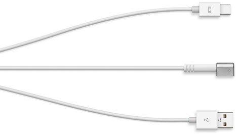
The design of the power cable is beautiful, simple, and clean. That cable and the cable that connects to the MBP (which starts as one cable on the monitor end, then splits into three at the MBP end) can be routed through the hole in the stand, keeping everything tidy.

Conclusion I love the amount of thought that went into these two products. The new port locations, trackpad, latch, and black display edges of the new MacBook Pro are all welcome touches and an improvement from the previous model. I also loved how the MBP works together with the LED Cinema Display, and was amazed at how good images looked on both. Of course, this comes at a price--I disliked the glossy screen at the points described above and found it something I "had to live with," a rather unusual sensation when it comes to Apple products.
Still, the MBP's new features, coupled with the new unibody construction, represents (to me at least) a clear design superiority over competitors' machines. I found it impossible not to fall in love with these two objects.
-
oFavorite This
-
Q4Comment
Directory Company Profiles
Core77
Industrial Design
Resources
Industrial Design
Resources
-
Core77 Directory
Find the Best Industrial Design CompaniesGo -
Speck Design
Speck Design is a Silicon Valley product design and strategy consultancy. For twenty years Speck Des...
-
Curve ID
Curve ID is a New York City based studio, offering a complete industrial design consultancy service....
-
Cardboard Helicopter Product Design
We are a boutique product development studio in Cleveland, Ohio, and we make ideas fly. Drop us a l...
-
SGW Designworks
We create hardware that endures. SGW Designworks is focused on the engineering and design of ...
-
Pulse Design Group
Pulse Design Group is an award-winning product design and innovation consultancy located in Los Ange...
-
219 Design
219 Design is an interdisciplinary product engineering firm based in Silicon Valley. Our team of mec...
-
Unbox Product Design
Unbox is a full-service design, engineering, branding, and custom manufacturing firm. Unbox works wi...
K
{Welcome
Create a Core77 Account
Already have an account? Sign In
By creating a Core77 account you confirm that you accept the Terms of Use
K
Reset Password
Please enter your email and we will send an email to reset your password.
Comments
Not sure how well a sandblasted matte finish screen would go down !