
Part 2 of 3
You may ask why there is a need for the design of pre-existing objects. In truth, factories need to run, so they make stuff. If that's not enough, manufacturers need to dream up new product lines to stay in business. Most of all, people need to continue to buy objects that confirm their status & construct their social identity.So we designers make progress in increments. This isn't a quick-fix methodology for a better, more designy, utopian society. It's about inching toward the perfect sunset.
To redesign an object is a history lesson. You examine the objects past, & listen to the hidden or forgotten needs & desires that are there. 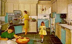
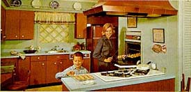
Illustrations 1, 2.
The modern American home kitchen, early 1960's.
Influenced by media imagery of domestic
perfection rather than architects and designers.
Design attempts to lend meaning to form. The execution phase of design brings the most pleasure to the designer. This is also known as the design development phase.
When you look at our containers you may question if any changes were made at all. Rather than addressing functional improvements we've focused our attention on the cultural contents & a slight visual & perceptual updates.
When you look again, you may see a crisper radius, a more prominent window, a subtle ironic gesture, all paying tribute to the object's history & relating it to today's needs.
Newness here could be perceived as slight transition in surface textures, most notably, a shift in translucency in a rectangular window that highlighted the food inside the container. This feature has been used previously in a number of decorative ways. Instead, we interpreted this transparent surface as a "window" or a "label," & now it takes on a different context & meaning.
Now strawberries in the container could be seen as a strawberry "label," pasta as a pasta "label," & moldy leftovers as a danger "label," & so on.
Our modular plastic containers nest so they behave like boxes that line a supermarket aisle, another ironic, or pop gesture. They have treads that are molded underneath for maximum grip & style. The Authentics signature material is light, colorful translucent plastic. By using tints of those joyous colors, pale as Jordan almonds, tantalizing as a roll of Smarties, we could bring those containers into your local Crate & Barrel.
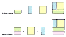
Illustration 3.
First conceptual sketches for modular containers, 1994.

Ideas either come in that proverbial bolt of inspiration or are the sum of hard work--sometimes they get totaled in a head on collision.
--Laurene Leon


Laurene Leon is an associate at Boym Design Studio, a multidisciplinary design consultancy and a product design professor at Parsons School of Design. Both are in New York City. She can be reached at BOYMSTUDIO@aol.com