 |


![]()
> archived articles
> write for core! be famous!
|
Form Divorces, Then Kills, Function by Amy Westervelt At the last magazine I worked for, we decided to start theme-ing our monthly issues in order to more completely cover one topic instead of brushing over several divergent ones. A concerted effort was made to make both editorial and photographic content speak to the theme of the month so that each issue of the magazine was a cohesive whole. In this case theme-ing worked to provide a better overall product. Much of the theme-oriented design we see today, however, presents an off-setting clash between innards and skin. More and more designers are being brought in not to marry form and function, but to complicate things. Here you've got a simple store front, but you need it to be a "destination shop," so you call in hot shot Slovenian designers, and pretty soon you've got a claustrophobic cave that looks like part of the Pirates of the Caribbean (I'm thinking here of jewelry designer Lara Bohinc's new store on Hoxton Square in London). |
|
 Prada 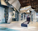 Issey Miyake  Rashid's Dish Soap |
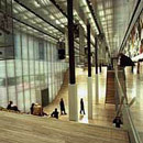
More and more, stores are becoming about the design and not the products at all. Take the Comme des Garcons store in Paris, for example-two stores are split into gallery space and clothing space, but the clothing space looks equally like a gallery exhibit...not exactly inviting to shoppers. And this is hardly the only label whose retail stores put the design of the building before that of the clothes. People are far more interested these days in what Koolhaas' Prada stores will look like than what Miuccia Prada's next collection will bring. Then there's Hermes' huge glass Renzo Piano store in Tokyo, and the huge and complex TriBeCa Issey Miyake designed by none other than Frank Gehry. In this case, these are all very high-end brands and so one could say that this form does follow the rather elitist function of the clothing. I would still argue that retail stores more concerned with the intellectualization of space than sales in a recession will soon be closing their million-dollar architectural endeavors, but fine. What about telephones? Have you shopped for a cordless phone recently? Designers are making enlarged cell-phones for home use-they're small and rectangular, and many of them have had colored plastic or chrome added to them to make them look better, but they're uncomfortable as hell to have a long conversation on and they rarely last longer than a year. Replacing phones yearly? Ridiculous! And dish soap. I was sent a bottle of very good dish soap that was encased in a nice-looking plastic bottle designed by the ubiquitous Karim Rashid. This is all well and good, but in the process of a move I realized that there's no way to shut the hole out of which the dish ssoap spews when yyou squeeze the bottle. This whole squeezing thing was touted by the company as "so simple." Uh, was dish soap really so complicated before? Don't get me wrong, I love the soap, and I dig the packaging, but why is it that one out of the two functions of the bottle (that it opens and closes) is flawed? It seems to me that designers are being encouraged to forget practicality entirely. |
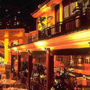 Ana Madara 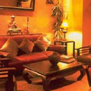 Ana Madara 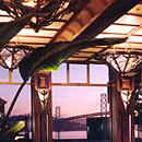 Boulevard 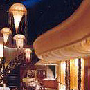 Farallon 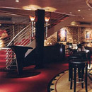 Jardiniere 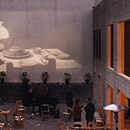 Foreign Cinema |
This trend is especially rampant in my home-city, San Francisco. Those of you who have seen Philippe Starck's redesign of the Clift will know what I'm talking about here. Though the lobby, lounge, and bar are beautiful, the rooms are so overstuffed with translucent orange glass and fluffy bed coverings that they seem even smaller than they are. For the nightly rates they're charging, you'd think the hotel would be more concerned with the comfort of the rooms than the design of the rooms, but you'd be wrong. One after another, the restaurants of San Francisco have fallen victim to this trend as well. About a month ago I was having dinner at Beaucoup, a trendy new Nob Hill restaurant, with a friend visiting from New York. "You know, the one thing San Francisco has over New York," he said, looking around, "is that every restaurant you go to has clearly put a lot of thought and money into design." To a fault, I say. Why does every restaurant have to have a "concept"? My friend's contention is that gaudy or no, bold design moves make a restaurant more interesting. I, on the other hand, have found that for every restaurant enhanced by an overbearing design scheme, there are three whose garishness gives patrons indigestion. What forms that thin line between "interesting" and plain-old tacky? Well, for one thing, there's the concept. These seem to fall into two categories: novelty and ethnic. In the latter there are dozens of Orientalist gems designed to evoke all the "exoticism" the West admires in the East: Ana Mandara (designed by Aline Ho and Peter McGinley), Shanghai 1930, and Le Colonial (designed by Greg Jordan) are prime examples. The designers of Japanese restaurant Ozumo (Tokyo design group Super Potato Co.), on the other hand, went the Zen route, creating an open dining space full of wood and natural tones. It's beautiful, if somewhat shocking in its sterility, and the place feels "authentic" even though it sits in a row of fancy restaurants along the Embarcadero. In the novelty category we find places like Boulevard, the aforementioned Beaucoup, Foreign Cinema, and Absinthe. Foreign Cinema is the only one with a truly unique shtick: they've got an outdoor courtyard where films screen nightly. Boulevard, designed by Pat Kuleto (also the designer of Fog City Diner, Farallon, and Jardiniere, amongst others) is housed in the Audiffred Building, an historical 1889 French-influenced building, and is therefore decorated in a "Belle Époque" style. More Bourbon Street than Moulin Rouge, the enormous dining room is filled with swirling wrought iron, ornate glasswork, and pressed tin. The food is delicious and simple; Kuleto should have exercised similar restraint with the fixtures. This is typical of Kuleto's aesthetic; both Jardiničre and Farallon offer similarly ostentatious dining rooms, complete with ornate glass fixtures, enormous booths, and swirling staircases. Very similar in style is the aforementioned Beaucoup. Slightly more gothic than Boulevard, Beaucoup nonetheless seems more like the boudoir of a Parisian prostitute who's made her way to San Francisco for the Gold Rush than like that of her sister who stayed back in Montmartre. Again, the food here is good; they could have, and should have, gotten away with a less convoluted design scheme. Absinthe (designed by Kate Disston and Kathleen Rose, Disston Interior Design) also goes for the Parisian/Saloon aesthetic, but manages to pull it off without seeming like the New Orleans restaurant at Disneyland. Why? Here's where the rest of that line between tack and taste is drawn: it's the lighting and the scale. Lighting and scale are also what keep Le Colonial from being as garish as Ana Mandara (though they both do the whole Indochine thing), and what make Ozumo and Shanghai 1930 seem authentic, though they're both poseurs. Boulevard, Beaucoup, and Ana Mandara have red/orange or gold light fixtures, oversized banquettes and tables made of darker woods, large entryways, and curtains made of velvet and other "lush" materials that don't let light through; it's all very heavy and complicated, which makes the food seem so. The designers of Le Colonial, Ozumo, Foreign Cinema, and Absinthe, on the other hand, opted for blue-green lighting, open space, and objects of a familiar scale. The only thing oversized at Foreign Cinema is the movie screen, and it feels right that way. The moral of the story is this: unless you've got a truly unique idea, leave the themes to the amusement parks. I'm all for new and interesting designs, but they should come into the equation first to complement function, then to improve aesthetics, not in the reverse. |
|
Amy Westervelt is a freelance writer living in San Francisco |
|