e
- Sponsored
Europe Sets the Tone for Global Design
Creative Director Kiwan Nahm reflects on the evolving role of materials, colors, and finishes in modern appliance design

This post is presented by the K-Show, the world's No.1 trade fair for the plastics and rubber industry. Visionary developments and groundbreaking innovations will again lead the industry into new dimensions at K 2025 in Düsseldorf, Germany.
In a compelling conversation with material expert Chris Lefteri, Creative Director Kiwan Nahm reflects on the evolving role of materials, colors, and finishes (CMF) in modern appliance design—and Europe's pivotal influence in shaping these trends. As appliances move toward minimalism and emotional resonance, Nahm argues that while LG translates global currents into its own design language, the original sparks—the "trend streamers"—originate in Europe. This exchange explores how LG blends inspiration from European exhibitions and lifestyle cues with its commitment to simplicity, artistry, and cultural reinterpretation—revealing a broader narrative of global design dialogue in the plastics era.
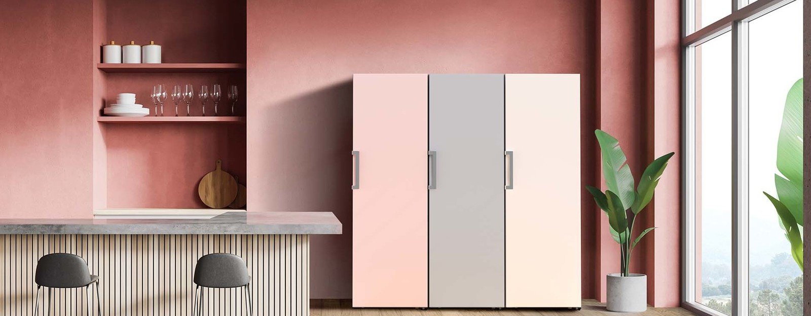
 As part of the Objet collection, LG’s Mist Beige colour range was developed as an alternative to traditional bold metal tones. The resulting ‘mist metal’ effect is softer and fits harmoniously into any interior environment. ; Copyright: LG
Chris Lefteri: So, Kiwan, tell me what you're doing in Germany, tell me a bit about your role.
Kiwan Nahm: I am officially the creative director of LG Europe Design Lab. My primary mission is to derive something for Europe, which means LG has a vast range of portfolio in different appliances or devices and all the electronics products. Specifically, Europe has a special sort of character in regards to lifestyle and custom preference. Therefore, we think it's important to create products that are really well perceived in the European market. In other words, we cannot sell the same product which is sold in the US to the European market because it's a completely different market. It is my mission to find out and analyze what's different in Europe and then transfer that into a design language that we can actually blend into our products so that it'll be well received in the European market by the customers here.
Chris Lefteri: That's very interesting. The reason I wanted to interview you as a designer from LG is because, if I look at the appliances that LG has been commercializing over the last few years since 2022, maybe 2021, I would say that they are very important, inspiring, CMF-leading products. For me, I look at what's coming out of Europe and all the other European appliance brands, and you really are giving them a run for their money. I mean, it's almost like, "Wake up guys, let's move away from steel and white!". It's interesting that you feel that you want to learn from Europe and actually take something or do something local, because it's almost like you're doing so much more interesting stuff in Korea!
Kiwan Nahm: Even though LG has been able to create something that attracts attention, and propose some emotional values in purchasing products, we find the origin of the trend is usually from Europe. We're looking at different trends or lifestyle exhibitions in Europe so that we can get inspiration from them. We then eventually translate that into our own design language. But the ideas, and the hints, what we also call the trend streamers, I think those are still coming from Europe. And Korea is one of the cultures which can well interpret that into our own movements, into what we're doing. For instance, cosmetics, fashion, entertainment, design itself, it's all originating from Europe.
Also, one of the reasons is that products, in terms of their physical appearance, are getting more and more minimal. We're trying to hide things. We're trying to hide whatever is unnecessary to see and feel. And then, because we're hiding everything, it is important that we have something that can serve as an appearance factor, something that can appeal, and so CMF will be one of the best tools to express that, a design that well displays the CMF, the kind of materials we're using, what colors and textures we're using, and that a product has to become more and more minimal.
The minimal design tendency is also coming from Europe, I think, because let's say, for instance, in Germany, where I currently am, the Bauhaus spirit is to hide everything, all the way down to the least functional sort of detail needed. Other than that, we're trying not to be too decorative, we're trying to become more natural. In that sense we can get a lot of inspiration from European furniture, spaces, interiors. There are also various creative minds in Europe who have the same philosophy.
So, it was interesting to experience all that and that's also one of the reasons why we think it's important to have a station in Europe, to find that out as soon as possible and as closely as possible.
Yes. So, when you're trying to bring these European trends into LG's products, you talk about the LG design language. Is there a very strong CMF design language at LG?
Nahm: I would say it depends on the product, and the character of the product, that we have as projects, because there's always a purpose for each product. For instance, there are products that have to give luxurious premium satisfaction, whereas there are also products which will be more functional and provide value versus the price paid for it. It depends on the mission or the purpose of the product but I think in general there's a minimum bottom line of quality above which CMF has to be standing. We cannot go lower than that or we should stay in this sort of quality range – it could be an emotional quality, or it could be a physical quality – so that we can provide at least this standard.
I guess, if I'm right, you have these different sub-brands, like LG Objet and LG SIGNATURE, so these are very different in the way that they appear and their stories in terms of the CMF. And I have to say that the SIGNATURE sub-brand is obviously the premium one, but I see that kind of quality in many of your products. I mean, for me, it's always delivered very well.
Nahm: There's this cascading effect which means, for example, with the origin of SIGNATURE, the idea was to launch a product which was not just premium; in fact, we've been calling it "hyper premium", which is to say something which is beyond premium, but that doesn't mean that we have to use the most expensive materials or finishes on the product. Instead, we ask ourselves: how can we actually provide something which is more premium than what's in the market?
And we kind of had success because SIGNATURE was a really good blend of stylish design but also the usability has been smart enough to compete in the market during that time. And since the success case of SIGNATURE, we've been able to cascade everything that's good in SIGNATURE into each appropriate product price level or brand tier meaning the cheapest refrigerator of LGE from the time before SIGNATURE is far different from the affordable ones that we're selling right now. There's probably a few years' gap, but I think within that gap, the existence of SIGNATURE made a huge difference, because it made us build – or even transform – the most affordable ones in a more quality-oriented way.
So I guess SIGNATURE, as that premium sub-brand, the top premium sub-brand, gave the organization confidence to then apply some of that to different products and also create subcategories below that?
Nahm: Right, so SIGNATURE has actually pulled up the standards of quality in all line-ups for the LG product portfolio. SIGNATURE started out as home appliances mainly and then there was also the television and all the other product ranges, so it was spreading out 360 degrees to elevate the overall design quality.
Very interesting. And then LG Objet is the more lifestyle-focused one? That came next, is that right?
Nahm: We planned to make the Objet collection more space-centric, more lifestyle, more interiors-focused, physically speaking. Internally, we initially called it Space Fit, which means that, dimensionally speaking nothing just pops out or interrupts the balance or the flow. And then because there are a lot of different styles in the interiors, or different lifestyles, we thought it would be interesting to give them some customizability to edit someone's own taste onto the surface of an appliance product that's sitting there, which after all are not small-sized ones.
It's very bold. These are not quiet objects.
Nahm: It's a huge, huge mass of electronics sitting in your space, right? From fridges to air conditioners and air purifiers, I mean, anything which is a title appliance is relatively big, quite incomparable. It's almost the size of furniture.
Right, but then rather than doing something that would be very safe and very neutral, you did something that was really "in-your-face" – lots of colours, lots of patterns – and that was quite a big risk because you don't make something for the masses, you make something that's very bold and very decorative. I'm thinking of the air purifiers, these little coffee tables, it's almost like a piece of Memphis in your living room!
Nahm: I mean, if you look the other way around, let's say refrigerators. The refrigerators before Objet collection used to be white, or metallic, or even black, or something with reflective glass surface, something expressing a huge presence in the space. I mean if you like it, that's okay. But if you don't, if there's anything you don't like, in terms of the surface of the refrigerator, it's a burden to have that sitting in your kitchen. It's basically a huge tank which you don't like that much or maybe you liked it before but now you don't anymore. In that case, you want to have something that's more harmonious sitting there, something that blends well with the furniture or any other installments in that space.
The term Space Fit also meant, from a CMF perspective, to be able to apply materials, colours, and all the finishes that are compatible or that blend harmoniously with the interior materials. I'm thinking about when we implemented the matte surface, the satin finishes, so that it's not glossy anymore. It's not pretending to be a hero of the kitchen anymore, but it blends into the space well, it still has a certain presence because it's got this ratio to the size sitting there. It still takes a lot of space in your kitchen, but it feels more friendly. It feels more subtle. And it feels more like a furniture rather than just a cooling tank.
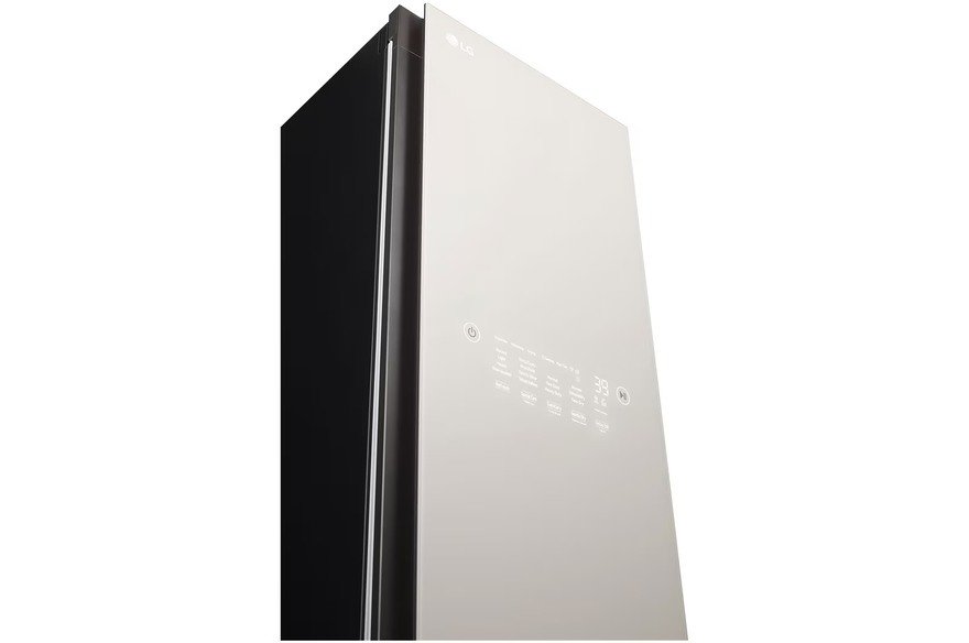
 LG has developed a range of matte and glossy finishes, each specifically designed to complement a particular colour hue, creating a subtle yet striking effect; Copyright: LG
I guess it must have been very hard to get that through, to LG as a company, to persuade the managers that this was a chance worth taking?
Nahm: It's always a matter of supply chain management if you try to launch various CMFs in one single platform, so it was a huge challenge for us too, but the way to persuade the stakeholders is that we were not trying to launch twenty, or fifty, or hundreds of different colours and finishes all at once. We kind of concentrated them into very essential tiers. For instance, there will still be users who would want something calm, something not distracting, but still want something that has a sort of premium appearance. So, in that case, we actually provided very subtle beige natural warm colour ranges with smooth textures. But also, there are users who would still want metals, so we try to avoid using glossy reflective hairlines which have been sitting there for centuries, and just try to change the surface with a very satin calm muted effect, but that still has this least metallic sort of resonance. We call that "mist metal", as if we sprayed some mist spray on the surface of the metal so it just reflects very smoothly.
That's very interesting, because when I was at IFA last September, I noticed that you offer different types of mattes, it's not like there's just "matte and gloss", but actually there are different levels of mattes. And it's quite clearly promoted in the branding.
Nahm: That is true because – I mean, you're the CMF specialist so you're quite well aware with this! – there are different glossiness levels. And, on the other hand, matteness levels. For instance, a certain specific matteness would fit well with brighter hues and brighter sort of effects whereas on the other hand a less matte level would actually suit more the darker ranges and so on and so forth. So, we cannot just unify everything to have this certain level of matteness or glossiness. So, we try to play with the small details so that they can make delicate difference. Even though we're talking about this, there are also not that many sort of variants in the matteness, because we classify them into very small numbers of levels so that we can actually manage to provide those effects in an efficient way.
Yeah, but it's clearly communicated in the marketing of the product as well. It's not subtle.
Nahm: Yes, it's necessary because there could be customers who would just be anti-matte or anti-glossy and there could be people who are in the middle – this is not that glossy, but still it's got the boldness of glossy. Another person on the other hand, might be like, this is as matte as we can get, it's all muted, it's what we call the set and finish. That's also how to persuade the customers when they're looking for new products.
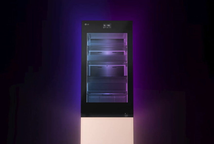 LG’s Mood Up range has brought new levels of customisation to the user, allowing for a change of colour and therefore experience, at a touch of a button; Copyright: LG
Yes, and consumers are very perceptive now, you know… everyone's curating their own interiors. So, they're very sensitive – like you said – to different matte levels. It's not just "matte and gloss". You mentioned earlier something to do with feeling and CMF and things feeling a certain way. And if I look at, let's say, the fridge that you worked on, which is called Mood-Up, it's very explicit that it's about feeling. So, is this very intentional and strategic, this idea of making your customers feel a certain way about LG products?
Nahm: The Mood-Up was first produced as a conceptual design markup… we had internal reviews and it was quite polarized because some people were thinking it was too much to have LEDs installed underneath the surface of a fridge. But others were saying, this is the ultimate version of Objet collection because the colours are almost infinitely customizable as opposed to certain ranges, which you cannot change that easily afterwards. Eventually, it was selling quite well and we were actually producing more than initially planned.
There was one time when we tried to turn on the Mood-Up colors so that it could look like an aubergine collection – the combination of dark green and beige. We played around with the LGB and there were people not able to distinguish which is the real six screen printed glass panel and which is the Mood-Up design panel. So, it can actually mimic the real physicality of a CMF solution. On the other end, with high luminosity, it can also serve as mood lamps or mood-making lighting features just like in RGB LED speakers and things like this. It's quite versatile and I think there's still a big possibility when our designers will play around with different RGB numbers on that platform.
When you were working on that, was it very hands-on, very experimental? Was it very playful for you as a designer?
Nahm: Yes, it was very interesting to notice, "Oh, this could be very physical but this could be also very digital." It it was interesting to play around with phygital CMF for the first time in my career. It was very fun, very interesting. And I thought there is something about the future of CMF in this because it's variable CMF. It's not something you have to change panel by panel. It's something you can just play around with the numbers through your application. It becomes a different physical solution. You know, for instance, like the holographic images in the Blade Runner films or anything like that, something which is virtual but precepted as physical?
OK, I want to talk about another product, the Universal UP kit?
Nahm: Oh, yes.
Because that's also a really bold, and a very assertive, very forward-thinking, very culturally-relevant project. How did that come about?
Nahm: Not just because we were trying to do the UP kits, we've been going through all our products currently in the market to find out how we could actually upgrade everything. Since software is very easy to be updated, like all the OSs and applications, they're updated on a few month basis, so we were thinking, is there anything we could do with the physical thing, maybe an UP kit or an add-on or maybe a replaceable sort of feature, that would be interesting? And we also thought it would be interesting and essential to become more barrier-free, which means from an ESG perspective, from a social sort of responsibility, how can we actually support all the customers, and not just a few? How could we actually evolve the product that we are selling in the market or even the ones that we already sold in the market? And since we've been using consolidated platforms for the same refrigerators, washing machines, we're using the same mechanical units, physical parts, so wouldn't it be great to launch UP kits or add-on kits so that we can actually propose more values and provide more services in that way?
And I guess the colours as well popping out? So, people can see the colours?
Nahm: I mean it was becoming more visible because we've been trying to hide everything. We're basically trying to be as intuitive as possible. The modern-day trend is to be as minimal as possible but there are also people who wouldn't feel very comfortable with that. The thing is, if you're using the UP kits, it's more visible. It's becoming more intuitive. It's sort of a boosting accessory so that everybody will eventually be happy to use it. There are also users who actually do not have the difficulties in everyday life but still want to have these accessories so they can actually play around with it. It has become more of a helping item but also an item to pursue a certain satisfaction.
So, if I understood it correctly, it wasn't just about inclusivity, it was about any user, whether they had disability or not, being able to upgrade or update their products through these accessories, is that right?
Nahm: Yes, it started out as a barrier-free sort of approach, but eventually has become something more upgradable. Upgradability and physicality, but not too difficult. Something very easy, very intuitive, and rather more playful.
Great. The last question is a very simple question, just to end the interview, which I ask everybody, and it touches on this idea of materials and emotions and memories, which is something that most people, or certainly a lot of designers, don't tap into. And the question is: what's your strongest memory of a material from your childhood and why?
Nahm: From my childhood? I think it is both the time when I had the pleasure – but also the suffering – from one same material!
I was playing around with a very strong, the oil ink-based marker pen. Yes. It's a very strong. I was playing around with it at home, maybe I was like five or six. And then at that time all the fridges in Korean homes were either in ivory or military-like khaki green colors. Ours was green and I thought, maybe I should draw something on that fridge door!
So, I was drawing graffiti on the surface of the refrigerator and I really liked it because if you draw something with a marker on the paper it just spreads out or it smears around and you don't feel that clean when you're playing around markers on the paper. But on the PCM or VCM – the pre-coated metal panel on the fridge door in the early 1980s – that was something I loved to draw on.
That's the material, right? It's not the pen. It's the pre-coated metal panel on the fridge door?
Nahm: Yes. But mums do not like kids messing around with markers in their homes, making a crazy sketchbook out of a refrigerator door! And so my punishment was to erase all that using cleaning liquids and it was really hard to erase them so my experience with this material was like: "I love to draw, I love to sketch on a painted metal surface, but I really hate to erase that thing!"
You were born to be a CMF designer. You wanted to colour in the fridge. That's what it was!
Nahm: From that moment on, maybe I was destined to become a CMF designer for appliances.
Yes it was, from that day! So, Kiwan, thank you very much for joining me today.

Directory Company Profiles
Core77
Industrial Design
Resources
Industrial Design
Resources
-
Core77 Directory
Find the Best Industrial Design CompaniesGo -
 Evolve Agency
We are an independently owned design agency that helps teams drive change. Together, we partner wit...
-
Alternatives
We're a full-service branding and creative agency. We specialize in building brands, companies and o...
-
DesignStein Studios, LLC
We are a team of industrial designers focused on developing products that are intended for tooling a...
-
SGW Designworks
We create hardware that endures. SGW Designworks is focused on the engineering and design of ...
-
Olivialand Studio
Olivialand Studio, founded by Olivia Blechschmidt, is a boutique industrial design consultancy that ...
-
Spatial Dynamics
Spatial Dynamics is a hardware product design and development agency located in Cambridge, Massachus...
-
RKS Design
RKS is an award-winning global product design firm and innovation consultancy specializing in indust...
K
{Welcome
Create a Core77 Account
Already have an account? Sign In
By creating a Core77 account you confirm that you accept the Terms of Use
K
Reset Password
Please enter your email and we will send an email to reset your password.