e
Examples of Good and Bad UX in Improvised Signage in Movie Theaters
Lately an amusing trend has popped up in a handful of theaters: Signage letting time-strapped moviegoers know whether they can leave after the final scene without missing anything. These signs are presumably improvised by staff, and their designs—and therefore their efficacy in conveying helpful information--vary widely.
Worst
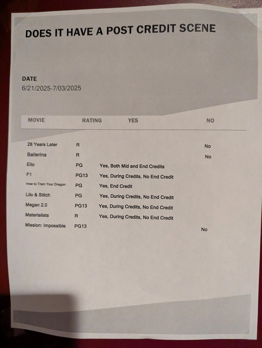
This is wordy, visually dense, and difficult to parse. It's redundant to have "Yes" and "No" appear both as column headers and within the rows; the "Yes" in the rows can be omitted, and the "No" in the rows ought be a simple X or similar. Furthermore they use two types of terminology, "mid" and "during," to mean the same thing. They ought use just one term.
Bad
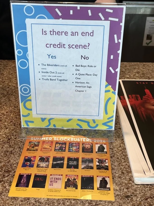
This is a little more clear than the Worst version above, but is difficult to read with all of the changes in font size.
Good
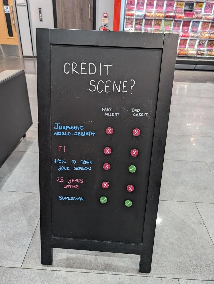
Clear graphics that use both colors and a symbol to reinforce "yes" or "no." The minimalist design is spartan and informative. Look at how few words are on here compared to the previous two. They even boiled the sign's title down to just two words, the least amount out of all the signs pictured here. I would say whoever made this sign has a natural knack for design.
Best
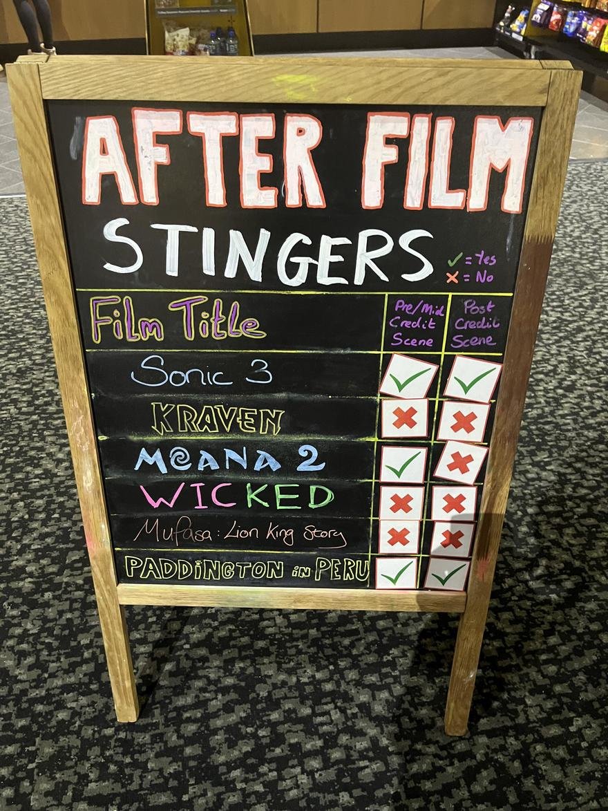
Has the benefits of the Good design, but is easier to read due to the large letters and graphics. They've also taken the time to emulate the font style of the movie title, increasing recognizability.
Looks Good But is Actually Bad
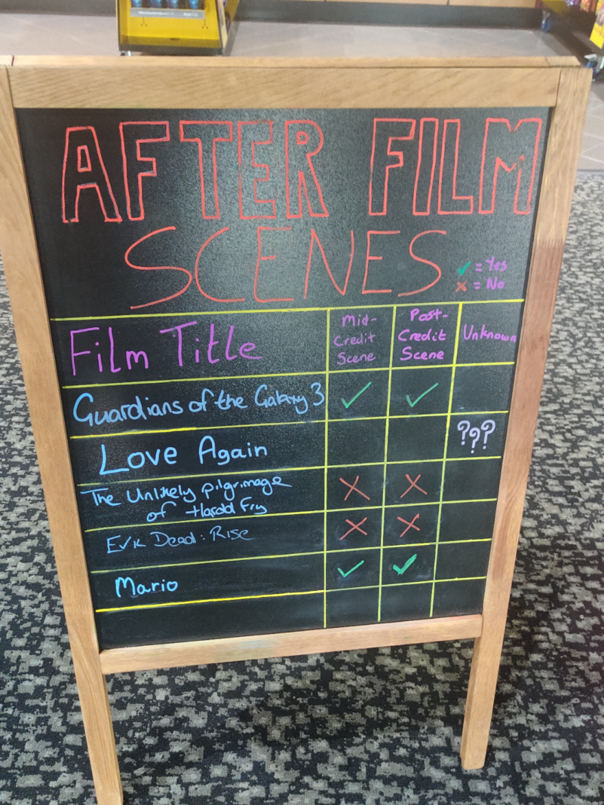
The final design at first looks like the Good and Best, but confusingly adds an "Unknown" column along with three question marks. I think a single question mark in both the mid- and post- boxes would have done the job more elegantly, and the "Unknown" column could have been omitted.
From an aesthetic standpoint, the "Good" is my favorite, but I think the "Best" conveys the information most effectively to a wide range of readers.
-
oFavorite This
-
QComment
Share your thoughts
Directory Company Profiles
Core77
Industrial Design
Resources
Industrial Design
Resources
-
Core77 Directory
Find the Best Industrial Design CompaniesGo -
 Bruce Mau Design
BMD is a multidisciplinary brand and design studio. At BMD, we are here to move organizations forwar...
-
Artefact
Artefact is a strategy + design firm. Design is powerful. It determines how we experience life, and ...
-
Formation Design Group
Formation is a product design + development company focused on human centered design innovation. To ...
-
Hatch Duo, LLC
Founded by an award-winning team with over 20 years of combined product design experience, Hatch Duo...
-
Datum3D Product Development
Datum3D is a one-stop shop product development company located in the Greater Boston Area. Founded i...
-
Whipsaw
Whipsaw, under the leadership of design visionary Dan Harden, is a highly acclaimed strategy, indust...
-
Astro Studios
Astro Studios of California launched in 1994, and since then our multidisciplinary teams have design...
K
{Welcome
Create a Core77 Account
Already have an account? Sign In
By creating a Core77 account you confirm that you accept the Terms of Use
K
Reset Password
Please enter your email and we will send an email to reset your password.