 |


![]()
> archived articles > write for core!
| Value Meal: Design and (over)Eating Curators: Laetitia Wolff and Aric Chen  |
|
| Value Meal: Design and (over)Eating will represent the United States at the International Design Biennale in Saint-Etienne, France, from November 6th through 14th, 2004. Featuring 20 commissioned experimental
projects by as many American-based designers, the exhibition seeks to explore design’s potential to address the obesity epidemic currently afflicting the United States and, increasingly, much of the world. Core77 asked Aric Chen and
Laetitia Wolff, curators of the show, to provide a few brief comments about their objectives for the exhibition: When we were invited to curate the biennial’s American section, our initial response was the most predicable one: we were going to mount a survey of contemporary work. We wanted to focus on designs for eating, as the obesity epidemic was very much on everyone’s minds. However, while we were aware of how designers were responding to the effects of poor eating habits—for example, by enlarging their seating designs—there seemed to be little discussion about how they might influence those habits. If one thinks of design as an agent of communication and a mediator of human behavior, it seemed only natural to give designers an opportunity to more proactively address the obesity epidemic at its source. Accordingly, for Value Meal: Design and (over)Eating, we asked twenty American designers to create projects that rethink the ways in which consumers eat, as well as the modes through which those patterns can be affected. Acknowledging the complexity of the problem, we sought the perspectives of practitioners from a range of disciplines, from graphics and packaging to industrial, product and interior design. They could emphasize problem-solving, communication, or even provocation, but each was asked to create something that somehow makes consumers aware of what, how, or how much they're eating during the act itself. As tangible objects and graphic works, or conceptual proposals and hypothetical scenarios, the results have been as varied as the designers themselves. Several have created interactive devices that measure food or the body, providing real-time information to help regulate eating decisions. Some have produced projects that question our relationship with food through sculptural or graphic means. Still others address the social and ethical implications of eating, some going so far as to develop implementable activist programs that promote more healthful habits. We attempted to be sensitive while avoiding political correctness. Part of the reason we chose the name Value Meal is because we wanted to acknowledge that eating, and the manner in which we eat, is integral to value systems that are perhaps worth revisiting at a time when their unraveling is having very real and detrimental health consequences. For sure, a range of social, economic, biological and cultural forces contribute to the obesity problem. However, while design may also be an accomplice, it’s clear that it offers solutions as well. This exhibit is an effort to examine the myriad ways that design might confront obesity in a largely conceptual way. But it is also an exhibit to stimulate ideas which, however obliquely, could eventually be put into practice. |
|
NIR ADAR; New York, New York Food Squish 30 x 40 inches 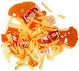
 Photographer: Peter Pioppo/ Studio P. For his Food Squish photo series, Nir Adar chose indulgent foods like the Big Mac, banana split, donuts, and ketchup and fries and placed them between two sheets of glass. Adar stood on top of them in order to squish them. This spontaneous act created compositions that are both beautiful and psychologically gruesome, exposing the dubious attraction of such foods in arresting images that Adar aptly describes as "deliciously disgusting." Nir Adar is a food artist. His classic culinary training and artistic vision have shaped a unique and highly sculptural approach to food. His work has been featured in several art galleries and in dozens of leading publications, including Food Arts, The New York Times and New York magazine. In 2004, he presented Heat as Directed, a large scale multimedia installation at Dining Design, an exhibition at Milan’s Salone Internazionale del Mobile. | |
| ERIK ADIGARD/M-A-D; Sausalito, California Adoriction Clock and Adoriction Lifevest Video, Dorito chip bags and straps 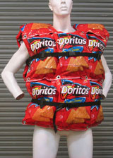
 Video & Programming (Clock): Gregory Cowley Design (Lifevest): Philip Foeckler Prototype (Lifevest): Angie Tadeo Model: Ilona Schweizer In two projects, Erik Adigard conveys a sense of urgency through the reappropriation of a junk food icon: the Doritos chip bag. In Adoriction Lifevest, Doritos bags are grommetted together to create a safety jacket. The bags—originally inflated with air to protect the chips inside—thus become a subversive reminder of the foods that threaten the health of those it now safeguards. Adoriction Clock, meanwhile, is a video in which a digital clock ticks in tempo with the crunching of chips as a woman rhythmically inhales and exhales into a Doritos bag. Life is measured (and suffocated) by food in an obsessive loop. Erik Adigard is co-founder, with Patricia McShane, of the award-winning interdisciplinary design firm M-A-D. His creative contributions range from branding and print graphics to video and web design. Among other projects, he has produced editorial, interface and concept designs for Wired magazine and branding for IBM, as well as numerous experimental installations including Chronopolis, an installation at the 2002 Villette Numérique. |
|
| ANTENNA DESIGN; New York, New York LottoBurger Cardboard, silver-plated brass, resin 19.5 x 12.5 x 4 inches 
 Renderings: Bruce Pringle LottoBurger is Antenna Design's concept for a healthy fast food restaurant. Taking the view that both fast food and the lottery promote irrational, compulsive behaviors—especially among the poor—it combines design with incentives to change people's behavior. At LottoBurger, customers choose among four menu categories (drink, entrée, side dish, dessert), each of which is color-coded. Each package is numbered so that a complete meal forms a four-digit lottery number. Their combined prices would be less than the total of a standard fast food meal plus lottery ticket, with the gambling proceeds subsidizing the higher cost of the better quality fare. Antenna Design was founded in 1997 by Masamichi Udagawa and Sigi Moeslinger and specializes in technologically-mediated experiences and interactive installations. It was featured in last year's Cooper-Hewitt National Design Triennial and is responsible for a number of high-profile projects, including the design of New York City's new subway cars and MetroCard vending machines, terminals for Bloomberg Professional, the Infoportal concept PC for IBM and self-service check-in kiosks for JetBlue. |
|
YVES BÉHAR/fuseproject; San Francisco, California Phat Table Wood and foam 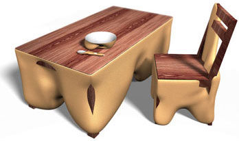 Renderings: Eskil Tomozy While many manufacturers have quietly enlarged their furniture products to accommodate an increasingly overweight population, Yves Béhar’s Phat Table does so with noticeable impact. Along with a chair and eating implements, the Phat Table is sprayed with foam as if it was getting as flabby as its user. Disproportion and its potential for physical incapacitation—the table is so overloaded with the foam that one’s legs no longer fit underneath it—become a disturbingly shared feature between both user and furniture. Yves Béhar is the founder of fuseproject. Béhar’s design strategy focuses on the emotional experience of the user and communicating it through storytelling. Recent clients include Birkenstock, Herman Miller, Swarovski, MINI, Nike, Toshiba, Hussein Chalayan and Hewlett Packard. In 2004, the San Francisco Museum of Modern Art mounted a solo show of Béhar’s work, spanning products, fashion, graphics, packaging, and environments. |
|
ERIC CHAN/ECCO Design; New York, New York PiNA (Personal Intelligent Nutritional Aid) 1.5 x .75 x .25 inches 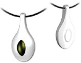

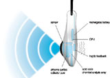 Envisioned as a "diet guardian angel," Eric Chan’s PiNA (Personal Intelligent Nutritional Aid) is a jewelry pendant that helps its wearer make better eating choices. It has a sensor that would read, within ten inches, the particles that are given off by food. It would then analyze their carbohydrate, calorie, sodium, cholesterol and even bacterial contents and, through a range of gentle vibrations, discretely alert users of the nutritional benefits or drawbacks of what they’re about to consume. ECCO Design founder Eric Chan works with leading companies to create everything from cell phones and MP3 players to cookware and furniture. With a mastery of form and sharp sensitivity to the senses, Chan pushes the conventional boundaries of familiar objects and elevates them to a different level. His clients have included Herman Miller, Virgin, Motorola, LG, Toyota, OXO and Cuisinart. His work has won many awards, and is included in the permanent collections of numerous museums. |
|
COMA; Brooklyn, New York Bittersweet Forty panels at 8.5 x 11 inches 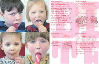 COMA’s Cornelia Blatter and Marcel Hermans sent a survey to friends and colleagues, asking only for such basic information as their age, height and weight as well as a description of their refrigerator’s content. In a culture preoccupied by its struggle with food and eating, such simple questions invariably became loaded ones. The answers they elicited were consequently introspective. The designers graphically integrated these responses into a series of portraits that create a visual ethnography of our relationship to food. COMA, founded by Cornelia Blatter and Marcel Hermans, is an award-winning interdisciplinary art and design studio with offices in Brooklyn and Amsterdam. In addition to serving as art directors for Frame magazine, Blatter and Hermans have developed, designed and produced work in media ranging from print and internet to environments, as well as books including: Hella Jongerius; Strangers: The First ICP Triennial of Photography and Video; Bruce Nauman: Theaters of Experience; and Architectural Laboratories: Greg Lynn & Hani Rashid. |
|
DESIGN GUYS; Minneapolis, Minnesota USA Obesity Propaganda Map Styrofoam panels, approximately 600 polystyrene drinking cups with paper inserts 12 x 8 feet 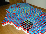
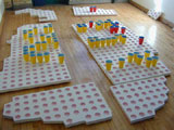
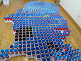 Fabrication: Stafford Norris III, Joshua Norris, Lily Carlson, Steve Sikora Diagrams: Anthony Buckland, Dan Holley The Obesity Propaganda Map is a monumental, three-dimensional map of the United States, made up of approximately 600 plastic drinking cups, some of which make out the pattern of McDonald’s golden arches. It represents the country in a landscape of obesity statistics. The interiors of the cups have been color-coded according to the obesity rates in corresponding states. Figures from 1994 are indicated on one side of the cups, and those from 2002 on the other, so that the extraordinary increase in obesity levels becomes dramatically apparent as viewers walk from left to right. Founded by Steve Sikora and Lynette Erickson-Sikora, Design Guys is a multidisciplinary firm specializing in identity and branding. In addition to helping launch the Aveda brand, it has served as official design firm for the Guthrie Theater and developed packaging, marketing and fixturing for the Michael Graves Design line for Target. Other clients have included Rollerblade, Tupperware, Apple, Public Radio International, and Bloomingdale’s. |
|
DAN HARPER/Elseware; Brooklyn, New York Waist Management Molded plastic 3.25 x 2.25 x 1.5 inches 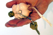
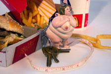 With its comically overweight figurine, Dan Harper’s kitschy keychain references the car and its culture of fast food pit stops, drive-throughs and roadside souvenir shops. Equating obesity and the automobile with a lifestyle that’s lacking in exercise, it is both an artifact and an indictment that’s literally attached to the car. With a tape measure that unwinds from the figure’s rear, it is a playful yet grotesque reminder of the connection between obesity and inaction. Dan Harper is a Brooklyn-based product designer who often infuses his work with tongue-in-cheek wit. He currently consults on projects from toys and movie props to furniture and exercise equipment. As a member of Elseware, a Brooklyn industrial design collective that explores the line between art and product, he has also helped organize several exhibitions of emerging design while manufacturing and marketing a range of experimental objects of his own. |
|
SCOTT HENDERSON; New York, New York Sandal Scales Injection molded thermo plastic rubber, tooled goatskin leather, LCD displays 10 x 5 x 4 inches 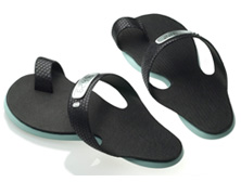
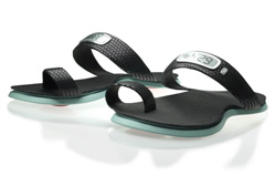 Scott Henderson’s futuristic, sporty sandals house an integrated scale in each of their soles. One measures body weight while the other calculates body fat percentages. Displayed on the sandal straps, this data provides real-time information that serves as a nudging reminder throughout the day to watch what one eats. Scott Henderson is principal at both his own product design firm, Scott Henderson Inc., and Mint, a tabletop and home accessories company. Until recently, he was vice president of design at Smart Design, a consultancy that counts Black & Decker, Cuisinart, Toshiba, Hewlett Packard and Issey Miyake among its clients. Henderson is listed as the inventor on over 50 US and European patents, and is responsible for such acclaimed designs as household products for OXO Good Grips. |
|
IDEO; San Francisco, California Crave Aid Steel, printed stickers 14 x 9.4 x 3 inches 
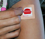
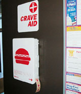 Team members: Thomas Overthun, Joanne Oliver, Pontus Wahlgren, David Webster, Ian Groulx and Jared Mankelow Acknowledging that our appetites for sugary and fatty foods are partly ingrained by evolution and biology, IDEO’s Crave Aid proposal treats them as an addiction. Crave Aid patches, like nicotine patches, would be worn on the skin and could gradually wean wearers from their physical habit while minimizing the withdrawal symptoms. However, rather than epidermally releasing chemicals as nicotine patches do, Crave Aid would satiate unhealthy eating desires through a placebo effect. As with First Aid kits, Crave Aid dispensers could be installed at any number of locations, providing emergency relief. IDEO is an international design firm that combines multidisciplinary teams of specialists in design, engineering, behavioral sciences, and business to create compelling experiences in products, services and environments. IDEO designed the first mouse for Apple and the first laptop computer. Other projects include the Handspring Treo and the Palm V; interiors for Amtrak's Acela high-speed train; and the Leap Chair for Steelcase. In 2004, the company was featured on the cover of Business Week magazine. |
|
MIRKO ILIC and Lauren DeNapoli; New York, New York Modulations Digital animation 
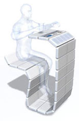 This modular furniture system, called Modulations, reconfigures the restaurant experience by incorporating interactive technology. Comprising six main modules—including a scale, LCD screen, solar panel, anchors, connectors and end units—it is easily-assembled, self-sustaining and can assist diners in making healthier menu selections. Its touch screen, which is powered by a solar-charged battery, displays nutritional information while also providing wi-fi internet access and food ordering capabilities. A built-in scale weighs the user both before and after the meal, aiding those who are tracking their daily food intake. Mirko Ilic is principal of Mirko Ilic Corp., a graphic design, illustration, digital and motion graphics studio. Previously, he served as art director of Time magazine's international edition and of The New York Times Op-Ed pages. He has received numerous awards and currently teaches illustration at the Masters level at New York’s School of Visual Arts. He is the co-author of two books, Genius Moves and Hand-Lettering, both with Steven Heller, and is currently co-authoring Design of Dissent with Milton Glaser. Lauren DeNapoli is a self-taught MAYA artist. She graduated from SVA in the early 90s where she studied computer graphics. After working in an architectural firm on 3-D visualizations and renderings, she joined MPC technology group as an instructor and demo specialist of Alias software. Through her travels at MPC she met Mirko and has been working with him for the last seven years on animation, design, and various digital illustrations. |
|
LUBA LUKOVA; New York, New York Thank you Paper inserts in inch plastic trays; 13 x 17 inches (trays); 25 x 25 x 50 (waste receptacle) 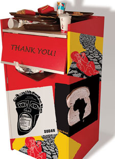
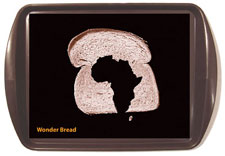 Framing the question of overeating as an ethical one, Luba Lukova’s multimedia project cites the disparity between the abundance of food in the industrialized world and the privation of developing countries. Infiltrating one of the primary sites of eating indulgence, her small-scale posters double as fast food tray inserts that provocatively address issues of famine, hunger and obesity. She has also applied these posters to a "Thank You" trash receptacle, commonly used in fast food outlets, splattering them in ketchup and mustard to emphasize the waste and carelessness that are a byproduct of prosperity. Luba Lukova is an award-winning artist and designer whose distinctive wood block-inspired and politically conscious graphic art has been published in the New York Times, Washington Post, Wall Street Journal and Le Monde, among many others. Her posters are widely exhibited and are in the permanent collections of New York’s Museum of Modern Art, The Library of Congress in Washington, DC, Zurich’s Museum für Gestaltung and the Bibliothčque Nationale de France |
|
JOHN MAEDA; Cambridge, Massachusetts Pastafries 20 x 24 inches  Continuing the FOOD (F-zero-zero-D) project he first exhibited at New York’s Cristinerose gallery in 2003, John Maeda has digitally created an abstract composition made up of food, in this case french fries and pasta. Maeda is a renowned innovator in the field of electronic media who merges humanistic subject matters with digital technology. Here, he applies the inorganic technological medium to fries and pasta, with their very sensorial associations, to create a whimsical image. John Maeda is professor of media arts and sciences at the Massachusetts Institute of Technology’s famed Media Laboratory. His early work redefined the use of electronic media as a core material for expression by combining skilled computer programming with sensitivity to traditional artistic concerns. He has been exhibited at numerous museums and has earned the highest career honors in both the US and Japan. |
|
MODERN DOG; Seattle, Washington Last Supper 30 x 40 inches 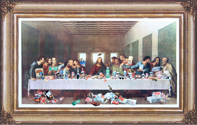 Photography: Ron Carraher Leonardo da Vinci’s Last Supper is one of the most famous examples of how food and traditions of communal eating have long been linked to rituals with profound, symbolic meaning. In a reproduction of the fresco, Modern Dog has replaced the holy meal with a range of junk foods. The custom of eating has devolved into a bad habit in a ridiculous scene that brings new meaning to Last Supper. Founded in 1987 by Robynne Raye and Michael Strassburger, Modern Dog first won national recognition creating posters for Seattle's fringe theatres. Today, the firm still specializes in entertainment promotions and posters with a style described as bold, satirical and irreverent. Modern Dog has also developed identity systems, packaging, illustration and products for such diverse clients as K2 Snowboards, Delta Airlines, Converse, Yale Repertory Theatre, The New York Times and Swatch. |
|
MARK RANDALL/Worldstudio; New York, New York Feed Me Series of 8.5 x 11 inch panels 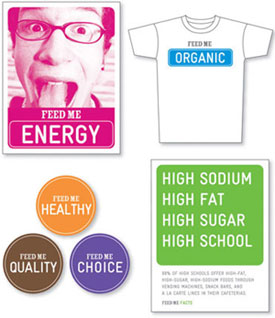 Design: Hyun Jung Kim, Ishan Khosla, Ann McBride Photography: Kelly Campbell Additional assistance: Sandy Markman The school lunch programs in American schools have recently come under criticism for not only providing meals of poor nutritional value but also instilling harmful eating practices that continue through adulthood. Acknowledging that bureaucratic and special interests are an obstacle to changing this situation, Mark Randall has designed an activist program that allows students and their parents to take a more proactive role. In this scheme, poster, button, sticker and t-shirt graphics, all featuring "Feed Me Facts," could be downloaded off a website, along with information on how to use them to mount a campaign to pressure school administrators to improve food quality. Mark Randall is principal of Worldstudio, a graphic design agency with clients across the nonprofit and corporate spectrum, from JP Morgan, Estée Lauder and Adobe Systems to the W.K. Kellogg Foundation, True Majority and the Metropolitan Opera. Randall is also co-founder of Worldstudio Foundation, a nonprofit that offers scholarships and mentoring programs to high school students in the fine and applied arts. |
|
GARTH ROBERTS/Group Inc.; New York, New York 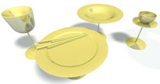
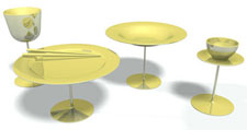 The abundance of inexpensive food is one of the chief causes of overeating. Garth Roberts’s place setting is designed to help overcome this at the individual level by promoting the idea of less being more. Its brass bowl, plate and two drinking glasses have been mirrored to give the appearance of greater quantity. At the same time, all are mounted on elegant stands that impart a sense of preciousness, adding both ceremony and appreciation to the act of eating. Garth Roberts is an industrial designer based in New York. In addition to designing products and furniture in the studio of Jeffrey Bernett, he works independently for international companies through Group Inc., a design cooperative he founded in 2001. Formally trained in Canada, Roberts’s work brings attention to the emotional relationship between humans, products, and their environment through a formal dialogue that engages the user through time. |
|
DAVID ROCKWELL; New York, New York Wheel of Food Fortune Metal lunchboxes, plastic doll legs, artificial turf, foam board, mirrors, electric motor, printed graphics 46 inch diameter 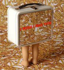
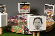 In an installation reminiscent of the work of artist Laurie Simmons, David Rockwell and The Rockwell Group have created a colorful, spinning lazy susan divided into wedges representing different processed foods. Placed around its circumference, six mirrored children’s lunchboxes are mounted on dolls’ feet and humanized on one side with nondescript faces. Together, they create a wheel of food fortune that reflects the maxim ‘You are what you eat (and what you choose to buy to eat)." As head of the Rockwell Group, David Rockwell is recognized for creating unique spaces characterized by rich materials, innovative narrative, and theatricality. His firm's acclaimed projects include Los Angeles’s Kodak Theatre, home of the Academy Awards; the Chambers and W Hotels in New York; and many restaurants. Rockwell Group was a member of the THINK team, one of two finalists in the World Trade Center design competition. In May 2003, Rockwell received a Tony nomination for his set design for the Broadway musical "Hairspray." |
|
|
STEVE SANDSTROM; Portland, Oregon Bubba Gulp 8 gallon steel drum 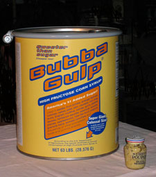
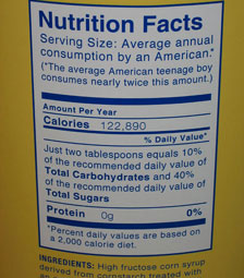 Many Americans shop at bulk outlets, where they can purchase large quantities of most any household or food product at a discounted price. Along these lines, Steve Sandstrom has produced a giant vat of High Fructose Corn Syrup, a sweetener commonly used in carbonated beverages and many other foods. The resulting steel drum has been designed to hold an average American’s annual consumption (8 gallons, or about seventy pounds). As with other bulk foods, you can buy a year’s worth at once. Accordingly, Sandstrom brings attention to one’s cumulative intake of an additive that’s high in calories and low in nutrients. Steve Sandstrom is creative director and partner at Sandstrom Design, a firm excelling in design, typography, and advertising. Recently, Sandstrom was involved with the creation and branding of Tazo Tea, a premium tea brand, for which he designed an award-winning identity and packaging. Other accounts include Levi Strauss, Converse, ESPN, Miller Brewing, Nike, Seagram’s, Steppenwolf Theatre, Adidas International, Nissan, Coca-Cola, Virgin, Microsoft, Marriott and Sony Pictures. |
|
SUPERHAPPYBUNNY; Los Angeles, CA Bwip 220 x 36 inches 
 Superhappybunny has imagined a sci-fi scenario in which a contraption called a Bwip could be attached to the body, converting its nutrients and energy into a consumer product, rather than fat. The resulting product—for example, an ashtray or toaster—would be determined by a pre-programmed "zygote" that would come with the device. Food and product consumption are thus linked and one literally feeds the other. Waste isn’t so wasted. Edwin Roses, Hayes Urban and Bart Haney are the designers behind Superhappybunny, a self-described idea foundry known for its irreverent wit. With a focus on objects and media for an evolving contemporary and popular culture, Superhappybunny has grown into a conceptual design studio with wide ranging projects from product and graphic design to future-casting. Recently, their work was included in the Cooper-Hewitt Museum’s National Design Triennial, the California Design Biennial, and I.D. magazine’s ID 40. |
|
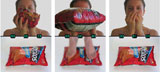
TOBIAS WONG; New York, New York "Waiter!" (Theres a fly in my soup) Ceramic with Swarovski crystal fly 9-inch diameter 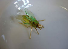
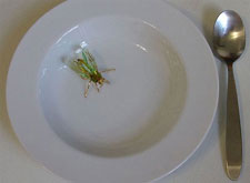 Tobias Wong plays on the familiar "Waiter, there’s a fly in my soup!" joke with a soup bowl that holds a Swarovski crystal fly which is held in place by a magnet. When the bowl is full, the fly is not visible. As one gradually eats, it slowly appears. In addition to displacing approximately 10 percent of the soup, its grotesque associations will either cause one to consume less in disgust, or the beauty of its crystal form will create a pleasing distraction. Either way, restraint and self-control become a precious thing. Originally from Vancouver, Canada, Tobias Wong is a product designer and artist who creates conceptual works that are both provocative and compelling. A graduate of New York’s Cooper Union, Wong treats design as a medium rather than a discipline. He often employs a reappropriative idiom that blurs the distinctions between high and low, and art and design, to provide clever critiques that transcend the hierarchies between them. His work has been frequently exhibited and published. |
|