e
Architecture
+ Follow this feed-
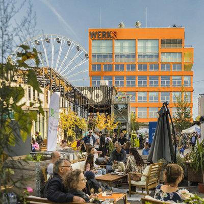
Transforming Industrial Legacy into Urban Interface
Architectural design reinterprets industrial land as a socially sustainable urban quarter
September 18 New
-

Why Darth Vader's Head is on the Washington National Cathedral
A strange 1980s design competition
September 10
-
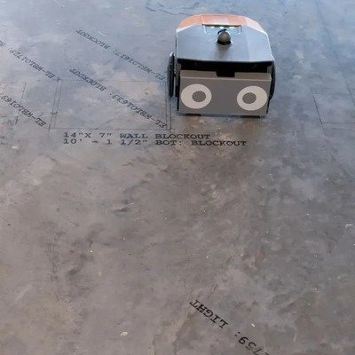
BIM-Driven Layout Robot Saves Time, Money
The Dusty FieldPrint is a great use of technology
September 10
2 Comments -

Dutch Engineers Move Massive Historic Swedish Church Three Miles Away
The mining town of Kiruna is Sweden's northernmost city, located within the Arctic Circle....
September 2
-
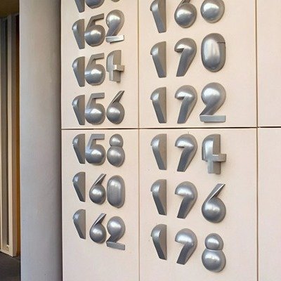
Sculptural House Numbers by Dutch Artist Reinoud Oudshoorn
Cast aluminum, with a 200-year lifespan
August 27
2 Comments 5 Favorites -

Experimental Hook-and-Loop Attachment System for Walls and Floors
The Graz University of Technology's ReCon Project
August 27
2 Comments -

Using Drones to Visually Complete Damaged or Unfinished Architecture
Studio Drift, the Dutch artist team, has combined drones with architecture in a novel...
August 20
2 Comments -
Architect Develops a Passive Cooling System Inspired by Anthills
CoolAnt, by Monish Siripurapu, makes good use of terracotta
August 15
1 Comment -
In Texas, 3D Printed Homes Inch Closer to Being Affordable
Icon gets an assist from the Mueller Foundation
August 13
3 Comments -

Tesla Opens World's Largest Supercharging Station—as a 24-Hour Diner in L.A.
Yesterday in Hollywood, Tesla opened the Tesla Diner, a retro-futuristic eatery that's also the...
July 23
2 Comments -

A Rotating House Concept That Makes Absolutely No Sense
We've seen round houses before, and a house that rotates. Those designs had some...
July 23
3 Comments -
At Zion Canyon, a New Hot Springs Resort
Designed by HFA Architecture + Engineering
July 15
2 Comments -
A Net-Zero Resort with Stainless Steel Pod Villas
Saudi Arabia's Shebara Resort appears to have been designed by aliens
June 30
1 Comment -

The 2025 Core77 Design Awards Built Environment Winners
This year's Built Environment jury was led by Bryan Chou, Design Principal at Mikyoung Kim
June 25
-

Architecture That Works With Challenging Terrain, Not Against It
The Zig-Zag Resort, by JA Joubert and UNS Architects
June 10
6 Comments -
A Dutch-Danish Housing Crunch Solution: Build Floating Neighborhoods
Rotterdam's Spoorweghaven Floating Community
May 29
-

Crazy Japanese Technique for Splicing the Bottom of a Rotted Column
Basara-tsugi, a/k/a the Otemon splice
May 19
1 Comment 7 Favorites -
An Interesting Twist on the Sunken Living Room
At the German Pavilion at Expo 2025 Osaka, by LAVA and Facts and Fiction
May 13
-

A Building Egress Feature that Creates an Optical Illusion
San Siro Stadium's towers appear to rotate after matches
May 9
-

-

-

The Cloud - Vendor Kiosk for City Hall Park in Burlington, Vermont
April 3 By Wade and Leta and Studio Renz + Oei
-
In Brazil, an Apartment Building with Swimming Pool Balconies
The VIW Building, by architects Ivan Ventura and Yuri Vital
March 11
1 Comment -
Architects Ask: What to Do With These Decommissioned Marble Fireplace Mantles?
The Deposees project, by Amor Immeuble
February 12
-

Architecture Student Invents Brilliant Formwork that Reduces Concrete & Steel Usage
"Unfold Form," by Lotte Scheder-Bieschin at ETH Zurich
February 10
1 Comment 7 Favorites -

One Spark Can Shift Perspective
Quiet changes have the power to create something transformative
February 6
-

The Baby Box: A $20,000 Unfolding Tiny Home by Boxabl
…but don't forget the additional site costs
February 3
-

-

Why a Tacoma and Certain Houses Survived the L.A. Fires
Tragically, Los Angeles resident Brandon Sanders found his home had burned to the ground...
January 21
1 Comment -

Icon to 3D Print Houses for the Homeless
The Community First! Village is tackling Austin's homeless population
January 16
4 Comments -

Bjarke Ingels Group Designs a Tent-Like Structure for Glamping
Modernism vs. nature
December 9, 2024
2 Comments -

Competition: Design a Tiny Home for a Young Couple
Sponsored by Kingspan
November 15, 2024
2 Comments -
A Trailer That Can Move Its Own Wheels Out of the Way and Lower Itself to the Ground
From the Netherlands, the Expandable Touchdown Trailer
October 23, 2024
1 Comment
-
Design Jobs
-
Hot On Coroflot


K
{Welcome
Create a Core77 Account
Already have an account? Sign In
By creating a Core77 account you confirm that you accept the Terms of Use
K
Reset Password
Please enter your email and we will send an email to reset your password.