e
Fine Art
+ Follow this feed-
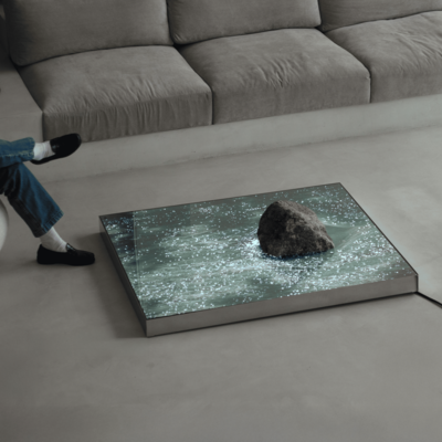
Six N. Five's Startling "Umbral," an Art Piece Where the Real and Virtual Intersect
Here's a rock sitting on what appears to be a mirror. In fact, beneath...
August 27
3 Comments -
ASCII Art, But Done with Manual Typewriters!
By Paul Smith and James Cook, typewriter artists
August 7
1 Comment -

-

Just Stunning: Fabian Oefner Creates Paintings Without Canvases
How does he do it?
July 28
2 Comments -
An Eye-Popping Kinetic Representation of a Tesseract
By artists/designers Julius von Bismarck and Benjamin Maus
July 17
6 Favorites -

-

Joshua Vides' Real-World Pop Art Cars
"Check Engine Light" is coming to NYC
March 4
2 Comments 5 Favorites -

Architect, Industrial Designer and Sculptor Robert Obier's Creations
Art Deco meets sci-fi meets Frank Lloyd Wright
February 20
2 Comments -

An Interactive Classic Videogame Art Piece that References the Stock Market
Breakfast's Billion Dollar Arcade Series
February 18
-

An Eye-Catching Installation: Lasers as Unspooling Thread
"Illoominated II," by Todd Moyer Designs
February 13
-

Former Architect/Mural Artist Hacks Sprinklers to Spray Paint
Hoxxoh's wild techniques
September 4, 2024
-

Fighting Through Mental Struggles: Incredible Renderings Created with Only a Pencil
Kohei Omori is like Chuck Close, but with products
August 15, 2024
4 Comments 5 Favorites -

Acrobatic Artist Bastien Dausse's Incredible Low-Gravity Invention
French acrobatic artist Bastien Dausse's work is "centered on (im)balance and the desire to...
July 19, 2024
2 Comments -

-

Trolling Brands by Democratizing Access to Color
Stuart Semple takes on luxury brand Tiffany & Co.
March 20, 2024
1 Comment -

-

Fun for Corporate Drones: The Escalator Slide
By artist/designer Julijonas Urbonas
February 12, 2024
-

-

Can You Figure Out How This Light Projection/Reflection was Done?
By water and light artist Lachlan Turczan
October 12, 2023
1 Comment -

Sculptures that Stunningly Disappear Based on Viewing Angle
By artist and quantum physicist Julian Voss-Andreae
May 22, 2023
3 Comments -

Tiny, Unauthorized Versions of Most Expensive Sculpture Ever Sold by a Living Artist
At $29, Jeff Koons is unlikely to notice
May 8, 2023
2 Comments -

Ai Weiwei's First Design-Focused Exhibition Draws Buzz for Lego Version of Monet's "Water Lilies"
Opens April 7th at London's Design Museum
March 22, 2023
2 Comments -

Helga Stentzel's Clothesline Animals
London-based artist Helga Stentzel created these wonderful Clothesline Animals, which she sells prints of....
December 19, 2022
-

The Trippy-as-Hell Drone Light Show from Burning Man
A fantastic spectacle from Studio Drift
September 20, 2022
-

Best of Fine Art Spotted in 2021
When you're burnt out on the relentless commercialism and consumerism of product design, fine...
December 27, 2021
-

Minimal Animal Sculptures Form Playground, Bike Racks, Hangout Spot
Luca Bosca and Iwan Snel's "Animal Factory"
December 14, 2021
-

At Bandai's Recycling Event, a 1:1-Scale Gundam Head Made from Discarded Plastic Runners
The Gunpla Recycling Project
November 23, 2021
1 Comment 5 Favorites -

Lee Sangsoo's 3D Line Drawings
Remember the gesture drawing exercises we did as design students? Korean artist Lee Sangsoo...
October 26, 2021
-

Art Student's Brilliant "Evidence of Our Idiocy" Vending Machine
Vendi, vidi, vici
October 7, 2021
1 Comment -

-

Guy Makes Pixel Art, Using Rubik's Cubes, of Christian Eriksen
Wright-brain thinking
June 23, 2021
2 Comments -
I Wish This Was a Trend Among Industrial Designers: David Hockney Wordlessly Pages Through His Sketchbook
All sketches, no talk
June 14, 2021
-

This Artist "Draws" Portraits by Shattering Glass with a Hammer
Simon Berger nails it
April 15, 2021
-
Design Jobs
-
Hot On Coroflot


K
{Welcome
Create a Core77 Account
Already have an account? Sign In
By creating a Core77 account you confirm that you accept the Terms of Use
K
Reset Password
Please enter your email and we will send an email to reset your password.