e
Lighting
+ Follow this feed-
A Low-Tech, Height-Adjustable Wall Lamp Made with a Minimum of Materials
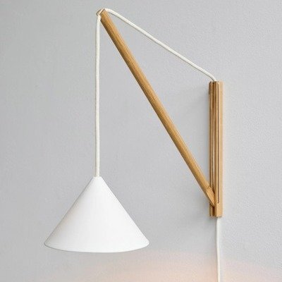
The Suspended Wall Lamp, by Danish design studio Moebe
September 15
-
A Low-Tech Take on Color-Changing Lighting
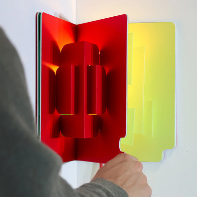
Industrial designer César Moncaut's Pop-Up Lamp
September 5
5 Favorites -
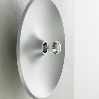
The Return of an Industrial, Minimalist 20th-Century Lamp
Astep revives the Model 262, by Gino Sarfatti
September 3
-
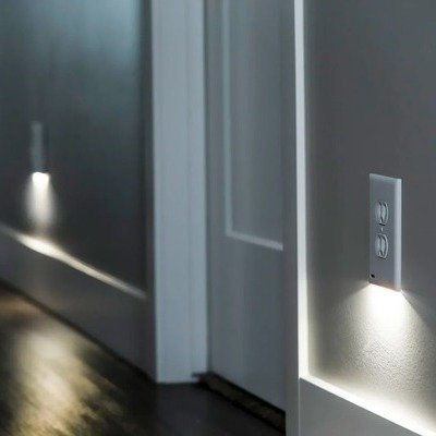
Innovations in Home Lighting: Smart Outlets vs. Smart Outlet Covers
One is a lot easier to install than the other
August 25
1 Comment -
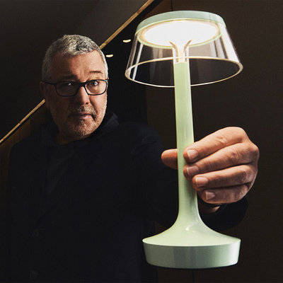
Flos Updates Philippe Starck's Bon Jour Unplugged Lamp
It's the 10th anniversary of Philippe Starck's Bon Jour Unplugged, a cordless rechargeable lamp...
August 14
-
-
Industrial Design Case Study: Customizable 3D-Printed Lamps
The Dollight, by Official Use Only, spawns a new company
July 18
2 Comments -

The 2025 Core77 Design Awards Furniture & Lighting Winners
This year's Furniture & Lighting jury was led by Michaele Simmering the Co-Founder and Creative Director at Kalon
June 27
-

Why America's Streetlights Have Been Turning Purple
A manufacturing defect that would please Prince
June 12
2 Comments -

Objets D'esign: Speaker and Lamp Versions of Jeff Koons' Balloon Dog
Lexon's releasing them this month
June 9
-
Peter Ivy's Gorgeous Rokkakei Hand-Blown Glass Pendant Lamps
These beautiful, hand-blown Rokkakei glass pendant lamps are by glassworker Peter Ivy. They're handmade...
May 14
-

1970s Italian Design Classic: Angelo Mangiarotti's Molla Lamps
Angelo Mangiarotti, a 20th-century Italian architect and industrial designer, liked industrial materials and had...
April 24
-

Basic Geometric Forms in This Sunset-Inspired Table Lamp
Horizon, by industrial designer Louis Filosa
April 24
-

The Rotary-Printed HIVE Lamp, by Stijn van Aardenne
Earlier this year, we watched in fascination as Dutch designer Stijn van Aardenne developed...
April 22
1 Comment -

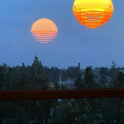
The Flying Sun: Persistent Overhead Emergency Lighting, Delivered by Drone
The future of portable lighting
April 8
1 Comment -

-
An Organic Chandelier Made from Decommissioned NYC Water Towers
The Stacked chandelier, by furniture designer Richard Haining
March 18
1 Comment -

Cubo Lighting, by Articolo Studios
Made by pouring molten glass into hand-gouged wooden molds
March 17
1 Comment -

Vaarnii's Pine Veneer Pendant Lamps
Swedish industrial designer Hans-Agne Jakobsson's techniques revived
March 14
1 Comment 5 Favorites -

Eye Candy: A Flashlight Concept That Doubles as a Reading Lamp
By industrial designer Onurhan Demir
March 13
2 Comments -

Design is In the Details: Grau's Fire Table Lamp
This gorgeous piece of industrial design is by Grau, a German lighting company whose...
March 4
-

Modern-Day Autoprogettazione: The Delta Lamp
By industrial designer Christoph Hauf and 1x1 Systems
March 3
-

ColorPipes: Lightweight Inflatable Lighting, Now with Programmable Colors
Pipe Lighting is the German manufacturer that revolutionized set lighting with their lightweight inflatable...
February 26
-

3D Printing on a Bed That Can Tilt and Move Yields Unique Objects
The Honey Dipper, by Dutch designer Stijn van Aardenne
February 14
-

Tile-Based Lamps, Yea or Nay?
UU Tiles, by industrial design firm Unknown Untitled
February 13
5 Comments 5 Favorites -

Low-Tech Candelabra: Industrial Designer Sebastian Bergne's Simple Candloop
The comeback of a 1990s design object
February 13
-

Reimagining How We Engage with Material Goods
Simmering shapes the world through quality and sustainability
February 4
-

Industrial Design Case Study: Sprout Streamlines Outdoor Decorative Lighting
Industrial Design Case Study: Sprout Streamlines Outdoor Decorative Lighting Sprout is an industrial design...
January 31
2 Comments -
-

Combo Furniture: LG Adds a Projector and Speakers to a Floor Lamp
Angelo Lelii's classic Polifemo lamp, from 1956, was a torchiere that featured a secondary...
January 14
-

A Pendant Lamp Inspired by Finland's Natural Light
Annabell, by industrial designer Elizabeth Salonen
January 8
-

An Obscure Industrial Design Classic: Angelo Lelii's Polifemo Floor Lamp
Inspired by a cyclops
December 12, 2024
-

An LED Bulb That Can Be Any Color You Want, All at Once
Moonside Design's Star Bulb
November 29, 2024
2 Comments


K
{Welcome
Create a Core77 Account
Already have an account? Sign In
By creating a Core77 account you confirm that you accept the Terms of Use
K
Reset Password
Please enter your email and we will send an email to reset your password.