e
Object Culture
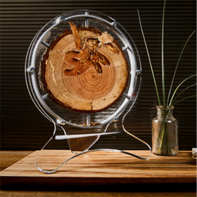
+ Follow this feed-

Core77 Weekly Roundup (9-8-25 to 9-12-25)
Here's what we looked at this week: Porsche develops wireless charging for EVs. Drive...
September 12
-
Core77 Weekly Roundup (9-2-25 to 9-5-25)
Here's what we looked at this week: Pizza cutters, from underdesigned to overdesigned. Dutch...
September 5
-
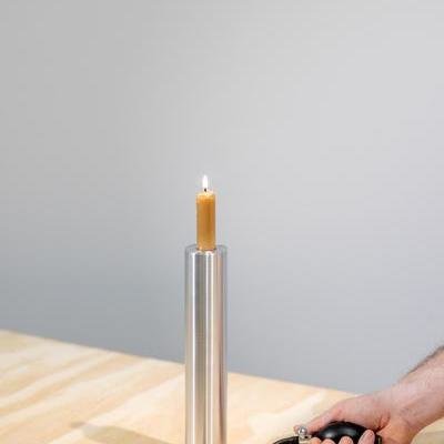
A Pneumatically-Height-Adjustable Candleholder
Rise + Shine, by industrial designer Dan McMahon
September 4
-
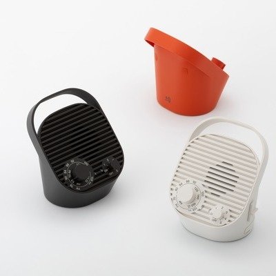
The Sketch Toolbox, by Industrial Designer Thomas Bentzen
Despite its cutesy house shape, this Sketch Toolbox's form is highly functional. The sloped...
September 3
-
-
Core77 Weekly Roundup (8-25-25 to 8-29-25)
Here's what we looked at this week: Handsome, stackable cork storage boxes by RelvaoKellerman....
August 29
-

(Unnecessary?) Objects for Measuring Children's Heights
A number of older houses across the world will have penciled height marks on...
August 26
3 Comments -

Core77 Weekly Roundup (8-18-25 to 8-22-25)
Here's what we looked at this week: The new, disruptive Antigravity A1 is a...
August 22
-
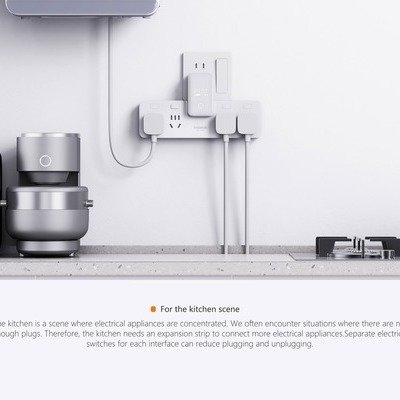
Remedial Design: A Power Strip for Underpowered Chinese Kitchens
Baseus saves the trouble of hiring an electrician
August 21
-
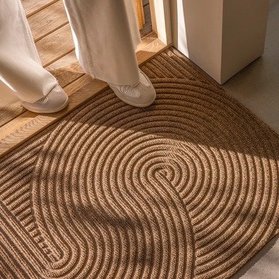
Designey Doormats, Borne From an Industrial Laundry in Norway
Heymat provides industrial performance with Scandinavian looks
August 21
1 Comment -

Core77 Turns 30 — Pioneering Internet-Native Magazine & Community Wants Your Opinion of the Past Three Decades of Design
This summer marks the 30th anniversary of Core77, the influential design platform that has...
August 18
10 Comments -

Sharpie Expands Range of Colors, Again
Their new Creative Markers target the crafting market
August 18
-

Core77 Weekly Roundup (8-11-25 to 8-15-25)
Here's what we looked at this week: Simone Giertz's Patch Cap offers on-head storage....
August 15
-

Choo Choo the Seahorse: When Industrial Design Meets Baby Products
Scott Henderson's Integrated Approach Creates a Product Ecosystem
August 14
-
Astronauts Will Return to the Moon Wearing Gold-Plated Oakleys
"Not humanity's first trip to the moon, just our clearest"
August 11
1 Comment -
Core77 Weekly Roundup (8-4-25 to 8-8-25)
Here's what we looked at this week: The Ulefone 33 Pro is a 2x4-sized...
August 8
-

An End to Reading Glasses? FDA Approves Vision-Improving Eyedrops
One of the many annoyances of aging is presbyopia. As you get older, your...
August 8
1 Comment -

The LifeStraw Escape: A Portable, High-Capacity Pressurized Water Purifier
This new LifeStraw Escape is a portable high-flow water purifier that can hold 5.25...
August 7
-
-
Plus Minus Zero's Braun-y Wireless TV Speaker
This looks like a Braun product from an alternate universe, but it was actually...
August 6
2 Comments -

A Titanium G-Shock Watch with a Hand-Hammered Finish
The MR-G combines tech with traditional craftsmanship
August 6
2 Comments -
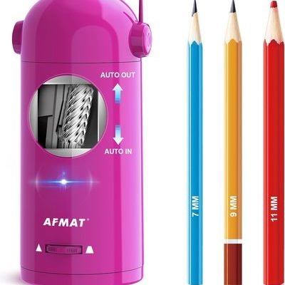
How You Can Make Even a Pencil Sharpener Go Viral
The AFMAT Automatic Pencil Sharpener follows a formula
August 4
-
Core77 Weekly Roundup (7-28-25 to 8-1-25)
Here's what we looked at this week: The Worksport Solis and Cor Hub are...
August 1
-

Better Than Foam: Fluid-Filled Earplugs for a Perfect Fit
Foam earplugs are a cheap solution for hearing protection, but they can become itchy...
July 29
2 Comments -

-

Core77 Weekly Roundup (7-21-25 to 7-25-25)
Here's what we looked at this week: The future is finally here: Enclosed, air...
July 25
-
Former Industrial Designer Develops Tool-Free Joinery Method Based on the Fibonacci Spiral
Anton Gaia's career arc is unusual: The Ukrainian national is a former industrial designer...
July 25
-

Enclosed, Air Conditioned Lawn Mowers by Curtis Industries
The future is finally here, with the Ferris ISX3300 with AC Cab
July 21
-
Core77 Weekly Roundup (7-14-25 to 7-18-25)
Here's what we looked at this week: Scooter design continues to evolve with China's...
July 18
-
-

A Utilitarian Design Classic: The Scaleo Folding Ladder
By industrial designers Roberto Lucci and Paolo Orlandini
July 15
5 Favorites -

Core77 Weekly Roundup (7-7-25 to 7-11-25)
Here's what we looked at this week: In France, a stunning pedestrian and bicycle...
July 11


K
{Welcome
Create a Core77 Account
Already have an account? Sign In
By creating a Core77 account you confirm that you accept the Terms of Use
K
Reset Password
Please enter your email and we will send an email to reset your password.