e
-
-
The Tactile Media Alliance: Rescuing Touch in a World of Screens
"It's so funny, they're called touch screens, right? And yet, they're not tactile."
August 28
7 Favorites -
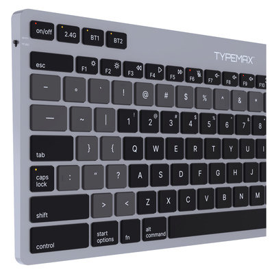
A Paradigm "Shift:" QwertyMax Keyboard Updates a 150-Year-Old UI
Dedicated symbol row, instant emoji access and more
August 25
5 Comments -
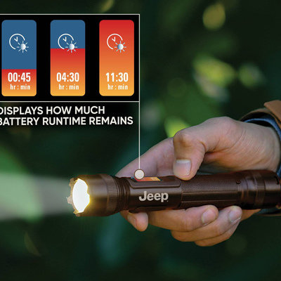
Examples of Good/Bad Execution of a UX Improvement for Flashlights
Different design choices for presenting how much power is left
August 20
2 Comments -
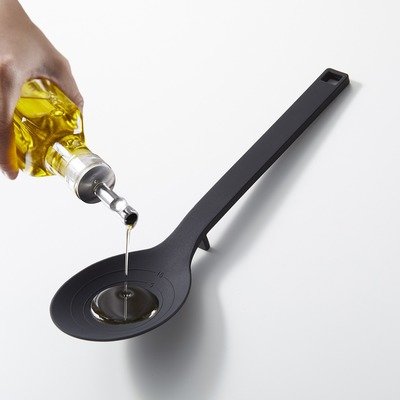
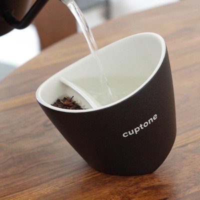
Great UX Detail on Yamazaki Home's Floating Spoon
A cooking utensil with a built-in rest, which keeps the business end off of...
August 19
-
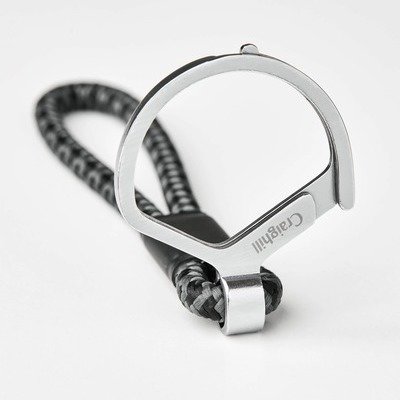
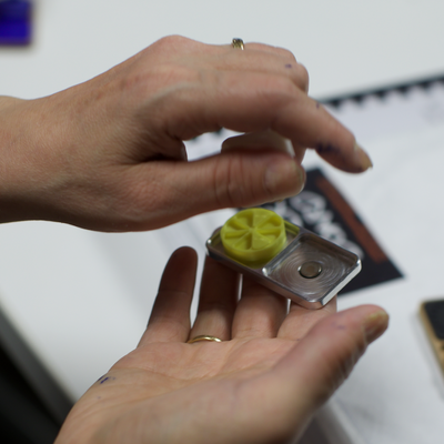
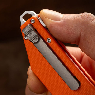
Craighill Improves the UX of the Key Ring
An industrial designer is supposed to notice the details of existing objects—especially the ones...
August 14
2 Comments -
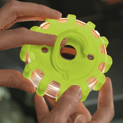
Better UX Than Roadside Flares: LED-Equipped Lizard Flares
When a new technology emerges, smart industrial designers think about how it could be...
August 5
2 Comments -
Horl's Scissors Have an Unusual Feature Designed to Make Sharpening Simple
Like all edged tools, scissors go dull. Re-sharpening them requires tools and skill, and...
August 4
3 Comments -
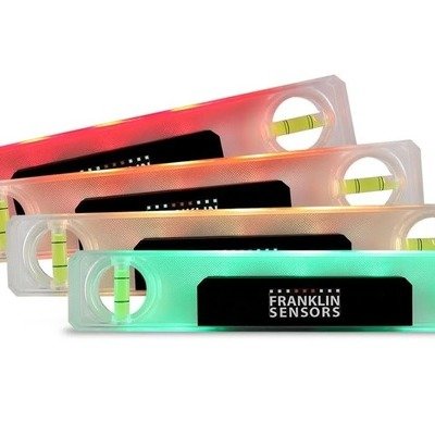
A Torpedo Level That Changes Color When It's Level or Plumb
By industrial design firm Cardboard Helicopter
August 1
1 Comment -
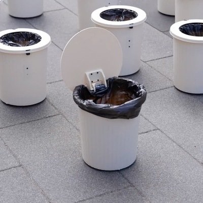
HTX Studio Explores the Design of Smart, Roving Trash Cans
This is a fantastic example of building on the work of others, then 10x'ing...
July 25
-
-

-
-

-
Remedial Design: Touchscreen Backlash Prompts Aftermarket Control Knob and Buttons for Teslas
Touchscreens were really cool 15 years ago, when the iPad first came out. Now...
May 28
2 Comments -

Apple's Unique Anti-Motion-Sickness Screen Animation Trick
"Vehicle Motion Cues" are provided on-screen
May 19
-

The Rivian R1T's Brilliant "Seamless Tailgate" Design Feature
All pickup truck manufacturers should have something like this
May 12
3 Comments -

Improving the UX of the Ice Cube Tray
Ice Device, by industrial designer Vanik Piliguian
May 1
1 Comment -

Remedial Design: Industrial Designer Invents Better Solution for Drying Out Hydration Bladders
Peter Williams' DRYE (Don't Ruin Your Equipment) system
May 1
3 Comments -

-
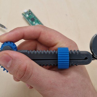
Clever Design for an Easy-to-Use 3D-Printed Solder Dispenser
The Solder Scroll, by Victor Designs
April 21
1 Comment -

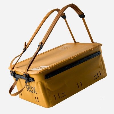
A Focus on UX, and Texas History, Inform the Design of Igloo's Party Bar Cooler
As cooler competition intensifies, designers look to details
April 9
1 Comment -
UI Experimentation: A Keyboard That Doubles as a Massive Trackpad
Clevetura's CLVX 1 targets Mac users
April 2
1 Comment -

An Ergonomic Scoop that Dispenses Ice Cream in Cylinders
The 85-year-old design is iconic to Californians
April 2
2 Comments -

-

Is Excessive Smartphone Use a Design Problem, or a Human Nature Problem?
Yea or Nay on the Light Phone III?
March 31
1 Comment -

Japanese Overdesign: Bookends that Don't Let the Books Fall Over When One is Removed
An obsession with UX and aesthetics
March 18
8 Favorites -
UX Rethink: A Physical Timer with a Progress Bar
Bars vs. pie slices, perhaps a generational thing
March 14
2 Comments -

Fantastic Design Details in this Zilch Bike Pump
Paying attention to the UX details others have ignored
March 10
7 Comments 5 Favorites -

Early UI Design: The World's First Keyboard was Invented for Deaf-Mutes in 1865
The Malling Hansen Writing Ball
March 10
-

An Actually Useful Application for Gesture Control: Headlamp Activation
Tradespeople love the NightBuddy 230
February 20
1 Comment -

The CenWatch: Yet Another Attempt at a Gesture Control Device
Almost 25 years after "Minority Report," people are still trying
February 20
1 Comment -

A Brilliant UX Detail on These Shinwa "Pick Up" Rulers
Steel rulers are a mainstay in many a workshop. From a design standpoint, you'd...
February 11
2 Comments

K
{Welcome
Create a Core77 Account
Already have an account? Sign In
By creating a Core77 account you confirm that you accept the Terms of Use
K
Reset Password
Please enter your email and we will send an email to reset your password.