e
Ford Almost Had Their "Flat" Logo Redesign--in 1966, by Paul Rand
Should they take it up now?
Recently multiple automakers have updated their logos to the "flat" aesthetic…

…but one company resisting the trend is Ford. In fact, their logo has remained remarkably consistent over the years:

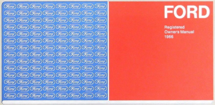
But as it turns out, they almost got their flat logo redesign…way back in 1966, by none other than legendary art director Paul Rand. Ford commissioned Rand to redesign their logo in the 1960s, and here's his proposal:


Ford obviously rejected it, though we don't know what their reasoning was. What do you think--ought they take it up today?

-
o1Favorite This
-
Q4Comment
Directory Company Profiles
Core77
Industrial Design
Resources
Industrial Design
Resources
-
Core77 Directory
Find the Best Industrial Design CompaniesGo -
Brainchild Engineering
Brainchild Engineering, based in Northville MI, is a product development and engineering company ded...
-
DesignThink, Inc.
DesignThink is a full service product development group focused on defining, developing and deliveri...
-
A2
A2 is a product development consultancy focused on design strategy, market and user research, indust...
-
 Michael DiTullo
Design. Every. Thing. Creating innovative products and brand experiences. For more than 20 years Mi...
-
Design 1st Inc.
Hardware product design is a high risk business - unless you have a design partner who has done it s...
-
Curve ID
Curve ID is a New York City based studio, offering a complete industrial design consultancy service....
-
Impel Studio LLC
We love making remarkable things. We’ve been at it for over a decade. Along the way we’ve developed ...
K
{Welcome
Create a Core77 Account
Already have an account? Sign In
By creating a Core77 account you confirm that you accept the Terms of Use
K
Reset Password
Please enter your email and we will send an email to reset your password.
Comments
Both the hand-lettered wordmark and a proposed "flat" version need some updating for modern times. Typographic logos have only improved in the last 50+ years, even with the new challenges of digital screens. A company like Ford can handle it, but only if they give it a real college try. No nibbling around the edges.
Ford's logo is extremely old-fashioned. No one (practically speaking) writes or reads in cursive any more. Your brand's logo is a hugely important tool for establishing brand positioning. If your brand looks like it came from your grandfather then its probably not a good look if you're trying to push new technologies, like EVs. So Ford should definitely dump their current logo and create something modern that shows that they are serious about taking us into the future. As a good example, see Kia's new logo. It is absolutely brilliant. Their new logo says that they are modern, sophisticated, and higher end. It's a great rebrand and matches their move from entry level vehicles to more mid-market, and matches what they are doing with their products. Ford needs to learn a lesson from this and do the same.
Am I the only one thinking Durex? XD Anyways, don't know if their logo or even the company existed at the time. Eitherway it's interesting how just by looking at it and then looking back at the current logo makes the latter look so old-school / vintage. I do like some logo refreshments as long as they're nicely executed or just a touchup.
All of these redesigns are dumb, imho. These are the most recognizable logos on the planet that have resulted from billions of dollars in advertising and decades of seeing them on (hopefully) great cars and trucks. Why would you flush all that down the toilet? Especially, in the case of VW and BMW, you just make a cheap copy of the original logo?