e
Product Design
+ Follow this feed-

Core77 Weekly Roundup (9-8-25 to 9-12-25)
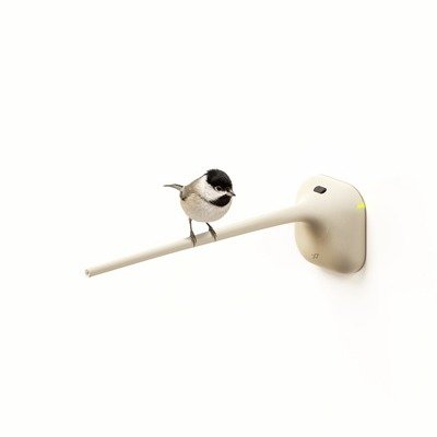
Here's what we looked at this week: Porsche develops wireless charging for EVs. Drive...
September 12
-
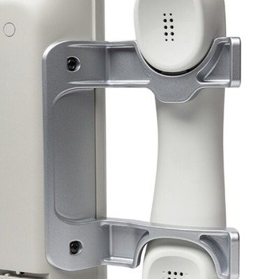
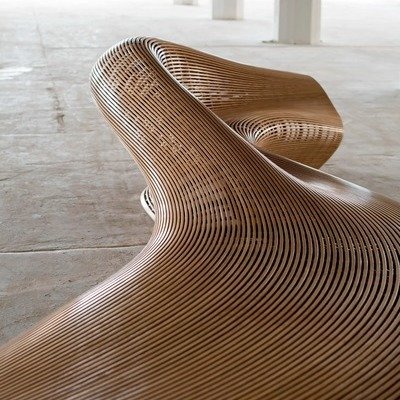
Industrial Design Case Study: A Nurse Call System for Hospitals
The Voalte Nurse Call Station, designed by Thrive
September 12
2 Comments -
-

-
Sponsored Post
From Imperfection to Innovation: How Digital Materials Support Sustainable Design
A conversation with Nicolas Paulhac, Director of 3D Content at Adobe Substance
September 9
-

Core77 Weekly Roundup (9-2-25 to 9-5-25)
Here's what we looked at this week: Pizza cutters, from underdesigned to overdesigned. Dutch...
September 5
-

A Pneumatically-Height-Adjustable Candleholder
Rise + Shine, by industrial designer Dan McMahon
September 4
-
Industrial Design Student Work: Finding a Use for Bark in Furniture
Barko, by Denise Merlette of ECAL
September 3
-
The Sketch Toolbox, by Industrial Designer Thomas Bentzen
Despite its cutesy house shape, this Sketch Toolbox's form is highly functional. The sloped...
September 3
-
-
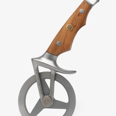
Pizza Cutters, from Underdesigned to Overdesigned
Dalstrong's looks like what they use to cut pizza in Valhalla
September 2
-
Core77 Weekly Roundup (8-25-25 to 8-29-25)
Here's what we looked at this week: Handsome, stackable cork storage boxes by RelvaoKellerman....
August 29
-
-
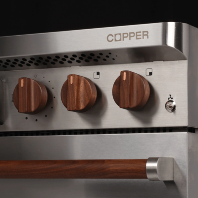
Charlie: A Revolutionary Induction Range with a Built-In Battery
It draws cheaper power overnight, no need to retrofit to 240V
August 28
7 Comments -
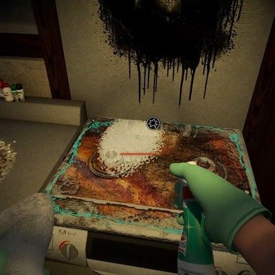
Video Game Mixes Cleaning Movement with Horror Genre to Sell Consumer Products
"Silent Cleaning" may be the future of marketing
August 27
1 Comment -
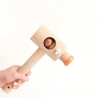
Eloi Goulhot's Mallet-Based Walnut Cracker
Walnuts are extraordinarily tough nuts to crack. Here in the 'States, we used to...
August 26
2 Comments 6 Favorites -

(Unnecessary?) Objects for Measuring Children's Heights
A number of older houses across the world will have penciled height marks on...
August 26
3 Comments -

Handsome, Stackable Cork Storage Boxes by RelvaoKellerman
I think this is kind of a stretch, but Munich-based industrial design firm RelvaoKellerman...
August 25
-

Core77 Weekly Roundup (8-18-25 to 8-22-25)
Here's what we looked at this week: The new, disruptive Antigravity A1 is a...
August 22
-
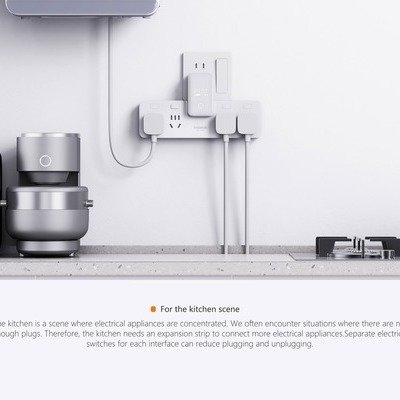
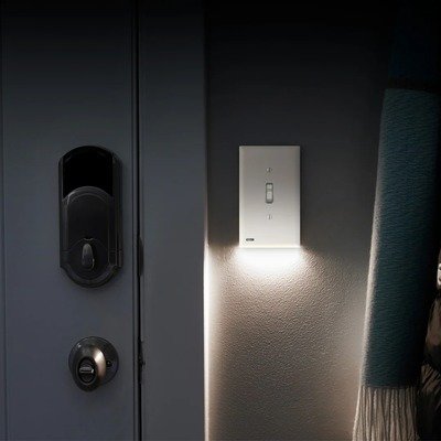
Remedial Design: A Power Strip for Underpowered Chinese Kitchens
Baseus saves the trouble of hiring an electrician
August 21
-
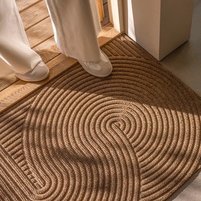
Designey Doormats, Borne From an Industrial Laundry in Norway
Heymat provides industrial performance with Scandinavian looks
August 21
1 Comment -

Great UX Detail on Yamazaki Home's Floating Spoon
A cooking utensil with a built-in rest, which keeps the business end off of...
August 19
-
Core77 Turns 30 — Pioneering Internet-Native Magazine & Community Wants Your Opinion of the Past Three Decades of Design
This summer marks the 30th anniversary of Core77, the influential design platform that has...
August 18
10 Comments -
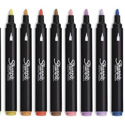
Sharpie Expands Range of Colors, Again
Their new Creative Markers target the crafting market
August 18
-

Core77 Weekly Roundup (8-11-25 to 8-15-25)
Here's what we looked at this week: Simone Giertz's Patch Cap offers on-head storage....
August 15
-

Choo Choo the Seahorse: When Industrial Design Meets Baby Products
Scott Henderson's Integrated Approach Creates a Product Ecosystem
August 14
-

A Pop-Up is Serving Jet-Black Ice Cream by CJ Hendry
What role does color play in our perception of flavor?
August 13
-
 Sponsored Post
Beyond the Launch: Why Designers Must Plan What Happens After
Former BMW design chief Chris Bangle argues for products designed for their "Second Existence" — creating jobs and redefining beauty
August 12
-

Solving Sleep Apnea Using a Conch Shell
It's a lot better than using a CPAP machine
August 12
1 Comment -
Astronauts Will Return to the Moon Wearing Gold-Plated Oakleys
"Not humanity's first trip to the moon, just our clearest"
August 11
1 Comment -
Core77 Weekly Roundup (8-4-25 to 8-8-25)
Here's what we looked at this week: The Ulefone 33 Pro is a 2x4-sized...
August 8
-

An End to Reading Glasses? FDA Approves Vision-Improving Eyedrops
One of the many annoyances of aging is presbyopia. As you get older, your...
August 8
1 Comment -
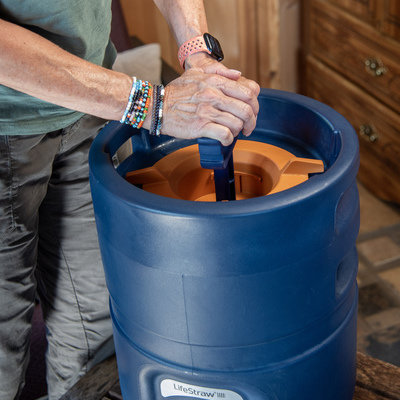
The LifeStraw Escape: A Portable, High-Capacity Pressurized Water Purifier
This new LifeStraw Escape is a portable high-flow water purifier that can hold 5.25...
August 7

K
{Welcome
Create a Core77 Account
Already have an account? Sign In
By creating a Core77 account you confirm that you accept the Terms of Use
K
Reset Password
Please enter your email and we will send an email to reset your password.